
Most small business owners understand the frustration behind the idea that they might be fixing the wrong website problem first. It feels like pouring money and effort into upgrades that do not move the needle.
The confusion starts when a business believes the website is judged only by how it looks. The fear comes from thinking competition is winning because their designs seem better.
This leads to panic-driven fixes and rushed redesigns. The result is wasted resources and no improvement in sales, leads, or calls.
Why This Mistake Happens
This mistake is extremely common. The root cause is simple. Most guidance online focuses on visuals. Templates, themes, colors, and trends are easy to sell because they look like progress.
A new banner or modern color palette feels like improvement. But first impressions in design do not matter if clarity and intent are missing. A website is not a painting. It is a tool powered by messaging and structure.
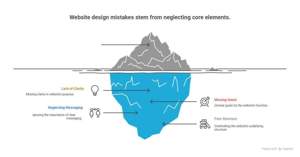
What Goes Wrong
The real problem sits deeper. It is the order in which changes are made. Most owners prioritize cosmetic upgrades before functional clarity. They change the home page banner but never clarify what they offer.
They switch to a faster hosting plan but ignore the confusing call to action. They add a chatbot but do not fix broken navigation. These decisions create websites that look better but convert the same or worse.
This turns into a cycle of disappointment. The owner feels like they did exactly what experts suggested, but the phone is still silent. Traffic numbers look fine, but inquiries are low.
Visitors spend a few seconds and leave because nothing hooked them. The business loses momentum, and confidence drops. This is the damage. It is not just about money. It is about energy and belief.
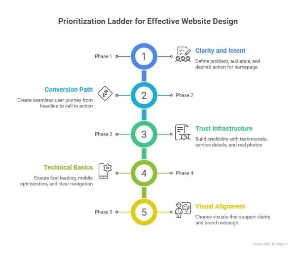
The Prioritization Ladder
There is a solution. The fix is not complicated. It requires the right order. Think of it as a prioritization ladder. Each step supports the next. Skip a step and the outcome weakens. Focusing on visuals before clarity is like painting over cracks. The cracks remain.
Phase 1: Clarity and Intent
Start by answering three questions.
What problem do you solve.
Who do you solve it for.
What action should the visitor take next.
These answers become the backbone of the homepage. They must be visible within the first five seconds. If a visitor cannot answer these questions by glancing at your homepage, clarity is missing. Without clarity, every other improvement is wasted.
Phase 2: Conversion Path
Create pathways, not pages. A website should guide visitors the way a salesperson guides a customer inside a store. Headlines lead to benefits. Benefits lead to proof. Proof leads to a call to action. Every step should avoid friction. If a page distracts from the next step, it needs restructuring. A website must feel like a path, not a maze.
Phase 3: Trust Infrastructure
Before visuals, build credibility. Trust is currency. It makes conversions possible. Add simple proof elements.
Before and after results.
Short client quotes with permission.
Clear service descriptions.
Pricing ranges when possible.
Direct contact options.
Real photos of the business, not stock images.
Trust makes design upgrades worth it. Without trust, design is decoration.
Phase 4: Technical Basics
Not advanced features, just essentials.
Fast loading
Mobile optimization
Tap friendly buttons on small screens
Simple navigation
Legible fonts with proper contrast
These must be addressed before creativity. A website that is slow or uncomfortable loses visitors before visuals get a chance to matter.
Phase 5: Visual Alignment
This is where design can finally shine with purpose. Choose styles that match the clarity and intent created earlier. Avoid trends that confuse the brand message. Visuals should support the story, not distract from it. Good design is alignment, not decoration. This is how visuals become powerful instead of costly.
How to Apply This to Your Website
Do not start with a redesign mindset. Start with a diagnostic approach. Look at your current homepage and determine which part of the ladder is missing.
If clarity is missing, do not upgrade visuals.
If pathways are broken, fix structure before design.
If trust is weak, add proof before animations.
If speed is slow, improve basics before new fonts.
This method protects your time and budget. It makes every improvement measurable. You stop chasing solutions that look good but fail. You start building improvements that grow revenue. Confusion fades because each fix has context. You gain control over your website instead of reacting to trends.
What Success Looks Like
Growth becomes more predictable with this mindset. A clear homepage leads to more time spent on site. Structured pathways lead to more inquiries. Trust elements lead to higher conversion rates.
Technical basics reduce bounce rates. Visual alignment becomes the final push that turns interest into action.
You do not need a perfect website. You need a website that knows what it is trying to achieve and supports that mission. When the structure is correct, every visual investment pays off more. The goal is not perfection. The goal is alignment.

Conclusion
Most small business owners fix the wrong website problem first because nobody explained the right order. Now you know. Start with clarity and intent. Build pathways.
Add trust. Strengthen basics. Then align visual design. The confusion of wasted effort fades when every improvement connects to a purpose.
Progress starts with clarity. Momentum builds through structure. Confidence returns with results.
If you feel like your website has been upgraded in the wrong order and you are ready to fix the foundation before spending more, Hyper Effects can help. We build websites that work like sales tools, not just digital brochures.
Start with a clarity audit, get a step-by-step action plan, and finally make your site easier to trust, easier to navigate, and easier to buy from.
Book a free clarity audit call and find out what to fix first: https://hypereffects.com/olympiawebdesign/