
You changed the colors.
You adjusted the layout.
You swapped fonts, moved buttons, rebuilt sections.
And still, nothing changed.
No increase in leads.
No rise in calls.
No real engagement.
At some point, frustration set in. It felt like the website should be working, yet it stayed quiet. That silence is usually when people assume the design still is not good enough. But here is the truth most business owners never hear.
The problem was never how the website looked.
The problem was that it was not clearly saying what needed to be said.

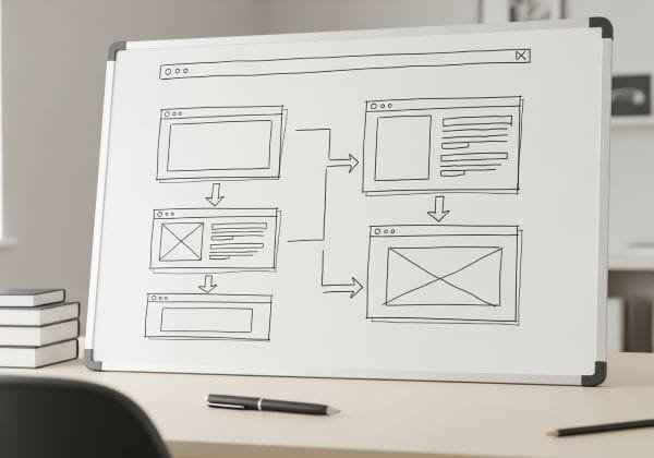
The Hidden Mistake Almost Everyone Makes
This mistake does not come from lack of effort. It comes from caring deeply and focusing on the most visible part of the problem.
Design feels tangible. You can see it. You can change it. Messaging feels abstract, so it often gets skipped or rushed. As a result, many websites are built from the outside in instead of from the inside out.
They look professional but feel confusing.
When someone lands on a website, they are not there to admire layout choices. They arrive with a question in their mind:
“Is this for me, and can this actually help?”
If that question is not answered quickly and clearly, the visitor hesitates. Hesitation looks like scrolling without action, clicking randomly, or leaving altogether. Not because the service is bad, but because the message is unclear.
Why Confusion Kills Results Quietly
Most websites talk too much about themselves and too little about the visitor.
They list services instead of solving problems.
They explain features instead of outcomes.
They assume understanding instead of earning it.
To a business owner, everything makes sense. To a first time visitor, nothing is obvious.
When the message is unclear, the brain has to work harder. People do not like working hard when they are unsure. So they leave. Not angry. Not annoyed. Just unconvinced.
That is why the damage feels invisible. Traffic exists. The site looks good. But results do not follow.
Over time, this creates doubt. Doubt in the website. Doubt in online marketing. Sometimes even doubt in the business itself.
The Real Cost of Fixing the Wrong Thing
Continuing to redesign without fixing communication leads to wasted time, wasted money, and growing frustration. Each visual change feels like progress, but nothing fundamentally improves.
Worse, a polished but unclear website quietly weakens trust. Visitors sense when something looks good but does not guide them. They may not articulate it, but they feel it.
Trust is built through clarity, not decoration.
The Shift That Changes Everything
The solution is not another redesign.
The solution is rebuilding the message before touching the visuals again.
Start with one simple question:
What problem is my ideal visitor trying to solve when they arrive here?
Not your service.
Their problem.
If you cannot describe that problem in one clear, human sentence, everything else will feel scattered.
Next, focus on the outcome they want. People do not care about methods at first. They care about relief, progress, confidence, or clarity. Your message should reflect where they want to go before explaining how you help them get there.
Structure the Website Like a Conversation
A strong website follows the same flow as a good conversation.
First, recognition.
“This understands me.”
Then, trust.
“This makes sense.”
Then, reassurance.
“This feels safe.”
Finally, direction.
“I know what to do next.”
The top of the page should answer one question clearly:
Am I in the right place?
Only after that should you explain how you work, why it is effective, and what the next step looks like. Calls to action work best when they match the visitor’s mental readiness. Messaging controls that timing, not design.
Every section should serve a purpose tied to understanding or decision making. If a section does not move the reader forward mentally, it creates noise. No amount of good design can fix noise.
When Design Finally Starts Working Again
Once the message is clear, design becomes powerful instead of compensatory.
Spacing highlights meaning.
Contrast guides attention.
Layout reinforces flow.
Design stops hiding confusion and starts supporting understanding.
A simple test is to read your website as plain text. If the message still feels clear and logical without visuals, the foundation is strong. If it falls apart, the issue was never aesthetic.
Another test is asking someone unfamiliar with your business to explain what you do after a quick visit. If they can explain it clearly, your communication is working.

The Moment of Clarity
This is usually the moment people say,
“I never thought of it this way.”
The realization is simple but powerful. The website was not failing because it looked wrong. It was failing because it was not guiding anyone.
Once that becomes clear, frustration fades. Decisions feel grounded. Changes have purpose. Growth stops feeling random.
You do not need to start over.
You need to realign.
When the message leads, the design finally does what it was always meant to do. Help people understand, decide, and move forward with confidence.