Poulsbo Websites – The quiet moment where interest disappears
Tourists rarely decide to skip a Poulsbo business in a dramatic way.
There is no frustration. No criticism. No conscious rejection.
What happens instead is subtle.
They open the website expecting to feel something.
They scroll once or twice, waiting for a signal.
They do not find it.
So they leave.
This moment is fast, emotional, and almost invisible to analytics. But it is where most tourism websites lose the sale.
If your site feels distant, generic, or interchangeable, visitors sense it immediately. Tourists are already navigating an unfamiliar place. They are subconsciously asking:
Is this place welcoming?
Does this feel local?
Do I feel comfortable choosing this?
When the website does not answer those questions, they move on without thinking twice.
The real fear behind website design problem
Most Poulsbo business owners experience the same confusion.
People are finding the website.
The information is accurate.
The design looks fine.
Yet something is clearly not working.
The unspoken worry is not about traffic or SEO.
It is this:
“If people are seeing us and still not choosing us, what are we doing wrong?”
That question creates frustration because the answer is rarely obvious. Nothing feels broken. But something feels ineffective.
This is not about effort or intelligence. It is about how humans make decisions when they are visiting somewhere new.

Why this problem happens so often in Poulsbo
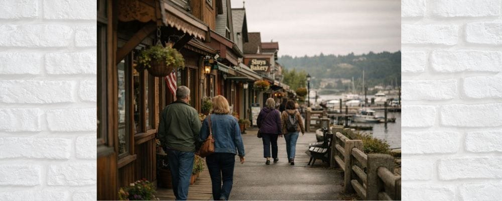
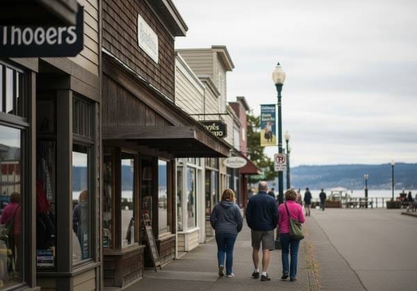
Poulsbo attracts visitors because it feels different from larger destinations. Calm. Personal. Walkable. Human.
Ironically, many websites remove those exact qualities.
Generic templates flatten local identity
Templates are designed to be neutral. Neutrality works for scalability, not for tourism.
When a visitor lands on a site that could belong to any coastal town, the brain flags uncertainty. The business may be real, but it does not feel rooted.
Tourists do not want perfection.
They want authenticity.
If the website does not visually or verbally reflect Poulsbo’s character, it quietly disconnects from the visitor’s expectations.
Professional language creates emotional distance
Many sites are written to sound polished and safe. They use formal phrasing, vague benefits, and carefully neutral tone.
The intention is credibility.
The result is coldness.
Tourists are not evaluating credentials the way investors do. They are evaluating comfort. They want to feel spoken to like a person, not addressed like a prospect.
When language feels stiff, visitors assume the experience will feel the same.
The site is written for locals, not visitors
Locals already know where you are. They understand the rhythm of the town. They know what is nearby and how long things take.
Tourists do not.
When a website assumes shared context, visitors feel lost. Directions feel vague. References feel unclear. The site feels like it was not built for them.
And when people feel excluded, they do not ask for clarification. They leave.
Visual tone does not match the town
Poulsbo is warm and textured. Wood, water, light, weather, small details.
Many websites rely on stark white backgrounds, sharp lines, and overly clean visuals. This creates a psychological mismatch.
The visitor may not consciously notice it, but their body does. The site feels colder than the place they are hoping to experience.
That discomfort reduces trust.
What damage this causes over time
This issue rarely triggers alarms. Instead, it creates slow, ongoing loss.
Visitors bounce faster than expected.
Tourist traffic does not convert.
Word of mouth stays offline instead of compounding online.
The most damaging effect is mental.
Business owners begin to believe that websites do not really influence tourist decisions, or that visitors only decide once they arrive in town.
In reality, many choices are already made before the visitor ever sets foot in Poulsbo.
The website is not failing loudly. It is failing quietly, at the moment trust should form.
The shift that changes everything
The solution does not start with design trends or marketing tactics.
It starts with a mindset change.
Your website is not a presentation. It is a welcome.
Once you understand that, every choice becomes simpler and more effective.
A practical framework that works for Poulsbo businesses websites
Step 1: Anchor the visitor in place immediately
The first screen should do more than identify your business. It should orient the visitor emotionally.
They should instantly feel where they are.
This means showing real surroundings, not abstract visuals. It means referencing light, seasons, waterfront, walkability, or town rhythm.
Even a single grounded sentence can do this.
When visitors feel placed, their anxiety drops. When anxiety drops, curiosity rises.
Step 2: Replace brand language with guide language
Tourists trust people who help them navigate unfamiliar spaces.
Your website should sound like someone explaining, not advertising.
Instead of listing features, explain experiences.
Instead of selling benefits, clarify expectations.
Instead of promoting yourself, guide the visitor.
This tone signals confidence without pressure. It tells visitors they are safe to explore.
Step 3: Make specificity your credibility
Tourists are highly skeptical of generic claims because every destination makes them.
Specifics cut through that noise.
Mention details that only someone involved would know.
Reference patterns you see in visitors.
Acknowledge small truths that feel lived-in.
These details do not just inform. They reassure.
Specificity makes the business feel real before the visitor arrives.
Step 4: Design for emotional ease, not pressure
Tourists browse in a tentative state. They are comparing, imagining, and planning loosely.
If a website pushes urgency too early, it creates resistance.
Clear paths matter more than strong calls to action.
Simple navigation matters more than clever layouts.
Gentle guidance matters more than persuasion.
When visitors feel in control, they stay longer and trust more.
Step 5: Warm the visual tone intentionally
Warmth is not decoration. It is balance.
Natural colors over harsh contrast
Texture over flat surfaces
Real environments over staged imagery
The goal is not to impress, but to relax the visitor.
When a site visually mirrors the town’s pace, the visitor’s nervous system settles. That makes choosing easier.
Step 6: Acknowledge the visitor directly
One of the most overlooked trust signals is recognition.
A simple line that speaks to first-time visitors, planners, or browsers can dramatically change how the site feels.
It tells the visitor:
You belong here, even if you are still deciding.
That feeling keeps people engaged.
Curious how visitors really judge your website before choosing who to contact? This quick breakdown shows what customers compare, what they notice first, and why small details shape big decisions:
https://hypereffects.com/business/silverdale-customers-compare-your-website/
What changes when this is done right
When Poulsbo websites aligns with how tourists actually feel, results improve naturally.
Visitors spend more time.
They explore deeper.
They imagine themselves there.
The decision no longer feels risky. It feels obvious.
The website stops competing on loudness and starts winning on comfort.
Websites That Visitor Love
If your website feels cold or generic today, it does not mean it is wrong. It means it was built without tourist psychology in mind.
Once you understand the gap, the fix is not overwhelming.
Warmth over polish
Clarity over abstraction
Place over sameness
When your website finally feels like Poulsbo, tourists do not need convincing. They already wanted to be there. Now they feel confident choosing you.