When something feels off, but you cannot quite name it
If you run a business in Seabeck, you may have had this quiet worry linger in the back of your mind.
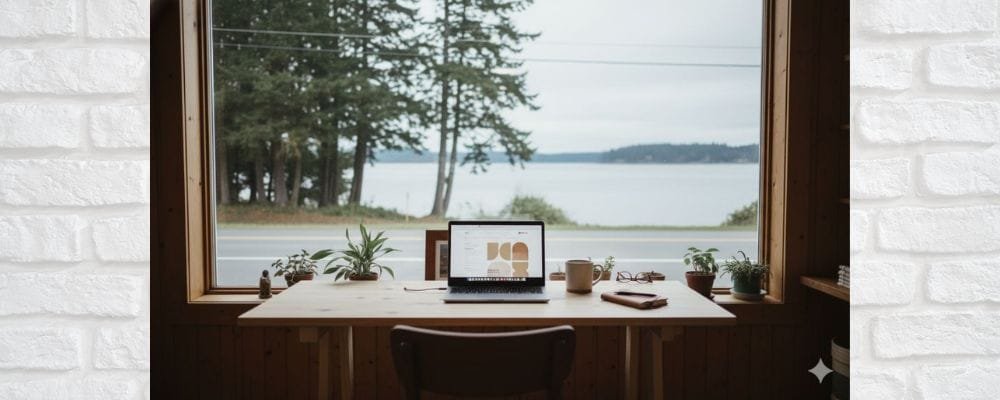
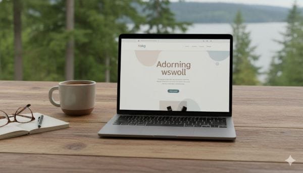
Your website looks polished. Modern. Expensive.
And yet, it does not feel right for the people who actually live here.
Customers browse, hesitate, then disappear.
They do not call. They do not book. They do not reply.
That disconnect usually shows up as confusion.
“I invested in a good website. Why does it not convert?”
“I thought professional meant premium.”
“I do not want to look small or outdated.”
Nothing is wrong with wanting to look credible.
But credibility in Seabeck works differently than it does in Seattle, Bellevue, or downtown Tacoma.
This is not a failure.
It is a mismatch.
Why this happens more often than people realize
Most local websites do not become “big city” by accident. They become that way through influence.
Templates are built for urban competition.
Design trends are shaped by SaaS companies, agencies, and high-volume markets.
Advice online pushes “sleek,” “minimal,” and “bold” without context.
The result is a website that sells visually, but not emotionally.
In Seabeck, trust is built through familiarity, not polish.
People expect warmth before efficiency.
They look for signs that you understand their pace, not just your service.
When a website feels overly corporate, hyper-modern, or sales-driven, it creates distance.
Not because customers dislike quality, but because they associate that style with outsiders.
It quietly signals:
- You may not be rooted here
- You may be priced for someone else
- You may not understand local expectations
That signal is rarely conscious, but it is powerful.
What actually goes wrong on a “big city” website
The tone speaks before the content does
Language that sounds impressive in metro markets often feels cold in smaller communities.
Phrases like “industry-leading solutions” or “scalable growth systems” do not translate locally.
Seabeck customers want clarity, not positioning.
They want to know who you are, how you work, and whether you are reliable.
Design hierarchy prioritizes style over comfort
Large hero headlines. Sharp contrast. Heavy whitespace.
These are not wrong, but they can feel intimidating.
Local customers tend to scan for reassurance first, not impact.
They want to see something familiar before they are asked to act.
Calls to action feel rushed
“Book Now.”
“Get a Quote Instantly.”
“Schedule a Call Today.”
In high-speed markets, urgency works.
In Seabeck, pressure creates resistance.
People here prefer a slower entry point.
They want to understand before they commit.
The quiet damage this causes over time
A website like this rarely fails loudly.
It fails silently.
Traffic still comes.
The site still looks good.
But leads slow down.
You may notice:
- More price shoppers than serious inquiries
- Longer decision cycles
- Fewer referrals mentioning your website
- Customers saying “I wasn’t sure at first”
The biggest loss is trust momentum.
Instead of your website doing the work of warming people up, you have to rebuild confidence manually in every conversation.
That is the opposite of a website that sells.
The real goal is not to look local, but to feel familiar
A high-performing Website Designer Seabeck understands this distinction.
Local design is not rustic.
It is not outdated.
It is not casual for the sake of being casual.
It is context-aware.
Your website should feel like a calm, confident introduction, not a pitch deck.

A practical framework to fix the mismatch
1. Ground the website in place, not branding trends
This does not mean adding stock photos of trees or water.
It means anchoring the experience in real context.
Use language that reflects how people here speak and decide.
Mention local rhythms.
Acknowledge real concerns, not generic pain points.
The visitor should feel, “This was built with people like me in mind.”
2. Replace authority language with clarity language
Authority comes from understanding, not complexity.
Instead of explaining how advanced your service is, explain how it fits into someone’s day, budget, or routine.
Clear explanations build more trust than bold claims ever will.
3. Soften the first interaction
The first screen should feel inviting, not demanding.
That means:
- Lower visual intensity
- Fewer aggressive calls to action
- More reassurance than persuasion
Think of it as opening a conversation, not closing a sale.
4. Design for confidence, not comparison
Seabeck customers are not comparing you to five agencies at once.
They are asking one simple question.
“Do I feel comfortable reaching out?”
Your layout, copy, and flow should reduce uncertainty, not create pressure.
5. Make the next step feel optional, not forced
Strong websites do not push.
They guide.
Offer pathways instead of deadlines.
Invite questions instead of bookings.
Let trust build naturally.
This is how a website that sells works in smaller communities.
What changes when the site finally matches the customer
When the alignment clicks, the results feel different.
Inquiries feel warmer.
Conversations start easier.
Customers arrive already trusting you.
You spend less time convincing and more time serving.
The website stops being something you explain and starts being something that supports you.
That is the difference between a site that looks impressive and one that actually grows your business.
Also Read – Why Kingston Businesses Miss Calls After Business Hours
A grounded reminder before you move forward
Your website does not need to shrink to succeed in Seabeck.
It needs to connect.
Professional does not mean distant.
Modern does not mean unfamiliar.
High quality does not mean high pressure.
With the right approach, your website can reflect who you are, respect where you operate, and quietly do its job every day.
Once you see the mismatch clearly, the path forward becomes simple.
You are not rebuilding from scratch.
You are realigning.
And that is where real growth starts.