Website Design for Gig Harbor Restaurants: What Actually Drives Reservations in 2026
The Digital Moment That Defines Your Business
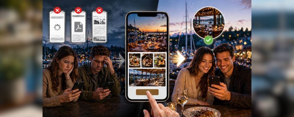
Every restaurant reservation in Gig Harbor begins the same way in 2026, a potential guest picks up their phone, searches for dining options near the waterfront or marina, and opens two or three websites in rapid succession. Within sixty seconds, that person has already formed a preference, and in most cases, the decision has nothing to do with the food itself. It has everything to do with how quickly the website loaded, how clearly the experience was communicated, and how effortlessly the reservation could be completed.
According to Think with Google, “53% of mobile site visits are abandoned if a page takes longer than three seconds to load.” For restaurants operating in a visually competitive dining market like Gig Harbor, that statistic is not abstract, it is the difference between a full reservation book and an evening of empty tables.
Understanding what makes a Gig Harbor restaurant website genuinely effective requires moving beyond surface-level design advice and examining the specific behavioral patterns, technical requirements, and local context that shape how diners make decisions in this market.
Mobile Optimization: The Primary Standard, Not an Optional Feature
Why Mobile Performance Is the Foundation of Restaurant Discovery
The overwhelming majority of restaurant searches now originate on mobile devices, and Google’s Search Central documentation confirms that mobile-first indexing has been the default since 2019, meaning that search engines evaluate the mobile version of your website before anything else. For Gig Harbor restaurants, this technical reality carries a practical consequence that shapes every design decision.
A diner arriving by ferry, walking along Harborview Drive, or sitting in a vehicle near the marina is not browsing casually or conducting research at leisure. That person is making an active decision under time pressure, and they expect the website to respond to that urgency by delivering information immediately and without friction.
Speed is the first filter that any restaurant website must pass. A site that loads slowly is not simply inconvenient, it communicates disorganization, and it triggers an immediate exit before the visitor has seen a single photograph or read a single word about the menu. The technical failure is invisible to the restaurant owner, who never receives a notification that a potential guest departed, yet the impact accumulates with every slow-loading page visit.
Once a website loads successfully, clarity becomes the decisive factor. The visitor is seeking three specific pieces of information in rapid succession: what the physical space looks and feels like, what the food looks like, and how to secure a table. Any design that requires scrolling, searching through navigation menus, or reading lengthy text before delivering those three answers introduces hesitation into a process that should be frictionless.
The Reservation System: Converting Interest Into Action
How Friction Silently Destroys Booking Rates
Restaurant owners frequently assume that a visitor who arrives at the website has already made the decision to dine. That assumption misunderstands the psychology of digital decision-making in a meaningful way. According to Baymard Institute, the average cart abandonment rate across e-commerce exceeds 70%, and the same principle of friction-driven abandonment applies directly to restaurant booking flows.
A visitor who lands on your site has demonstrated genuine interest, but interest is not commitment. The distance between those two states is precisely where most restaurant reservations are quietly lost, and the cause is almost always unnecessary complexity in the booking process.
The reservation button must be immediately visible, not below the fold, not tucked into a secondary navigation menu, not embedded in a contact page, on every device, in every screen orientation, without requiring a single additional scroll. Each additional click in the reservation flow represents a measurable point of potential abandonment, and each point of abandonment represents revenue that the restaurant will never know it lost.
As OpenTable’s 2024 Restaurant Technology Report notes, “Restaurants with streamlined online reservation systems see significantly higher conversion rates from website visitors to confirmed bookings compared to those requiring phone reservations or multi-step digital processes.”
For Gig Harbor restaurants catering to anniversary dinners, celebration evenings, and planned waterfront experiences, the stakes of booking friction are even higher. These guests are not making spontaneous decisions, they have arrived at the website with clear intent to book, and a confusing or cumbersome reservation path is sufficient to redirect that intent toward a competitor who has made the process simpler.
Menu Design: Transforming Your Most-Visited Page Into a Conversion Asset
The Case Against PDF Menus and Outdated Presentation
The menu page is, by significant margin, the most visited page on any restaurant website. Visitors consult it before making a reservation, during their decision-making process, and frequently while seated at the table. Despite this reality, as Upserve’s Restaurant Industry Report has consistently documented, the menu page remains among the most neglected elements of restaurant website design.
The use of PDF menus represents one of the most common and damaging practices in restaurant digital presence. On a desktop computer, a PDF menu may function adequately. On a mobile device, which represents the majority of restaurant website traffic, it creates immediate friction. The visitor must pinch to zoom, scroll within the document frame, and navigate a format that was not designed for a small screen. That experience interrupts the decision process at the precise moment when the restaurant should be building appetite and confidence.
A modern, well-structured menu page loads directly within the website, formats automatically to the visitor’s screen size, organizes dishes clearly by category, and displays pricing transparently. Hiding prices creates uncertainty, and uncertainty consistently slows or prevents booking decisions.
Gig Harbor’s dining audience skews toward experienced, detail-oriented consumers, a high-income demographic that evaluates presentation as an indicator of the overall dining experience. A menu that appears outdated or difficult to navigate does not merely frustrate the visitor; it signals that the same lack of attention to detail may be present in the kitchen or the service.
High-quality food photography embedded directly within the menu represents one of the highest-return investments a restaurant can make in its digital presence. According to SevenRooms’ research on restaurant digital marketing, dishes with accompanying photographs generate substantially higher order rates both in digital environments and in printed menus. Real photographs of actual menu items build confidence and allow the visitor to begin forming an emotional connection with the dining experience before they have left their home.
Local SEO: Ensuring Discovery Before the Diner Knows Your Name
Structuring Your Website for Gig Harbor’s Search Landscape
The majority of restaurant discovery does not begin with a branded search, it begins with an intent-based query. A visitor types “waterfront dining Gig Harbor,” “restaurants near Gig Harbor marina,” or simply “best seafood near me,” and the search engine returns a ranked list of options. The restaurants that appear in those results capture consideration from guests who were not yet aware of them. The restaurants that do not appear are, from the perspective of those diners, invisible.
Local search engine optimization is not, as it is sometimes mischaracterized, a matter of inserting geographic keywords throughout the text of a website. It is a more fundamental discipline that involves communicating clearly, to both search engines and human visitors, exactly where the restaurant is located, what it serves, and what kind of experience it provides.
As Moz’s Local SEO Guide explains, “Local search algorithms prioritize relevance, proximity, and prominence, and websites that clearly articulate their geographic identity and service category are systematically favored in local results.” For Gig Harbor specifically, this means that a restaurant website should reflect the distinct geographic identities within the community: Harborview Drive, the waterfront district, the marina, and the surrounding neighborhoods all carry specific meaning to both local diners and visitors arriving from Tacoma, Seattle, or the peninsula.
Technical structure plays an equally important role alongside content clarity. Proper use of schema markup, specifically, LocalBusiness and Restaurant schema as documented by Schema.org, helps search engines understand the type of business, its hours, its location, and its cuisine category without ambiguity. As search increasingly incorporates AI-driven recommendation systems, this structured data becomes the foundation upon which automated recommendations are built.
Photography and Atmosphere: The Visual Case for the Dining Experience
Why Visual Content Is Not a Design Choice, It Is a Business Requirement
Gig Harbor’s dining scene is, at its core, an experience-based market. The harbor view, the movement of boats on the water, the quality of light during a summer evening, and the warmth of an interior dining room on a Pacific Northwest winter night are not incidental features of the dining experience, they are central to why guests choose to dine in Gig Harbor rather than elsewhere. A restaurant website that fails to communicate that atmosphere is competing with one hand tied behind its back.
When a visitor cannot see the space, they are forced to imagine it. In a competitive digital environment where other restaurants are presenting compelling visual content, imagination rarely wins. The visitor forms their preference based on what they can see, not what they are asked to envision.
Professional photography that captures both the physical environment and the food itself serves a specific psychological function: it reduces the uncertainty that precedes any purchasing decision. According to Nielsen Norman Group’s research on trust signals in digital environments, users form first impressions of websites within 50 milliseconds, and those impressions are driven primarily by visual content rather than text.
For restaurants that draw visitors from Tacoma, Seattle, or from ferry routes serving the Kitsap Peninsula, the visual case for the experience is especially critical. These guests are choosing between unfamiliar options based on digital impressions alone, and the website functions as the primary mechanism by which that impression is formed.
User-generated photography, images taken by actual guests and shared with permission, adds an additional layer of credibility that professional photography alone cannot provide. The authenticity of guest images communicates that the experience being promised is the experience that is actually delivered, which is one of the most powerful trust signals available to a restaurant’s digital presence.
Seasonal Content Management: Keeping the Website Synchronized With the Business
Why Static Websites Undermine Dynamic Restaurant Operations
Gig Harbor operates within a clearly defined seasonal rhythm that shapes dining patterns, tourist traffic, local attendance, and operational hours. The summer months bring heightened waterfront activity, increased visitor volume from ferry traffic, and an outdoor dining culture that affects both menu composition and the character of the experience. Winter months shift the audience composition toward loyal local guests whose expectations and preferences differ meaningfully from summer visitors.
A restaurant website that fails to reflect this seasonal evolution creates a specific and damaging form of disconnect: the visitor sees information that may no longer be accurate, and that inaccuracy, whether it concerns menu offerings, operating hours, or seasonal events, introduces doubt at the precise moment when the website should be building confidence.
Content management flexibility is therefore not a technical luxury, it is an operational necessity. Restaurant owners and managers should be able to update menus, adjust hours, add seasonal events, and refresh photography without requiring the involvement of a web developer for every change. A website that is difficult to update will, as a practical matter, not be updated consistently, and the resulting information gaps compound over time.
According to BrightLocal’s Local Consumer Review Survey, 64% of consumers report that they have found incorrect contact information or hours on a business’s website, and 63% say that this inaccuracy negatively affected their trust in the business. For a restaurant operating in a market where trust and reputation are foundational, outdated website content carries a cost that extends well beyond the specific visitor who encountered the error.
Common Weaknesses in Gig Harbor Restaurant Websites
The Accumulation of Small Failures
Most restaurant websites that fail to convert visitors into guests are not failing because of a single catastrophic design error. The pattern is more nuanced and therefore more difficult to diagnose without deliberate evaluation. What typically occurs is an accumulation of smaller issues, each one appearing minor in isolation, that combine to create sufficient friction to push visitors toward a competitor.
Slow page loading caused by unoptimized image files or poorly chosen hosting is one of the most common and most consequential of these issues. Menus presented as PDFs or in poorly formatted text create friction at the highest-traffic page on the site. Reservation buttons buried in secondary menus or contact pages interrupt the booking intent of visitors who have already decided they want to dine. Outdated photography that no longer reflects the current state of the restaurant or the menu erodes trust in ways that are difficult to recover from.
The visitor who encounters these friction points does not complain and does not explain their departure. They close the tab and move to the next result, and the restaurant never receives any indication that a potential guest was lost. This invisibility is precisely what makes accumulated small failures so damaging, they are entirely self-concealing, and they continue producing the same negative outcome until a deliberate diagnosis and correction is undertaken.
The 2026 Standard for Restaurant Websites in Competitive Markets
What Effective Execution Actually Requires
The standard for a high-performing restaurant website in 2026 is not defined by advanced technology or complex design. It is defined by consistent execution of a small number of fundamental principles, each of which is well understood and entirely achievable with appropriate attention.
A website that loads within two seconds on a mobile device, presents compelling visual content of the space and the food above the fold, delivers the menu in a mobile-optimized format with transparent pricing, places the reservation mechanism at the center of the user experience, reflects the genuine character of its local environment, and is maintained with current and accurate information will consistently outperform websites that neglect any one of these elements, regardless of how accomplished the restaurant itself may be.
As Web Almanac’s 2024 Performance Report documents, the median restaurant website fails to meet core mobile performance standards, which means that the competitive advantage available to any restaurant that does meet those standards is both significant and accessible.
The guest makes their decision before they walk through the door. The website is where that decision happens, and the restaurants that design for that moment, rather than simply designing for the sake of having a digital presence, are the restaurants that consistently fill their tables.
Frequently Asked Questions
How important is mobile optimization for Gig Harbor restaurant websites? Mobile optimization is the single most important technical foundation of a restaurant website in 2026. The majority of dining decisions are made on mobile devices, often under time pressure, and a website that fails to perform on mobile is systematically losing the reservations it should be capturing.
Should restaurant menus be presented as PDFs or as web pages? Menus should always be presented as native web pages formatted for mobile viewing. PDF menus create significant friction on small screens, interrupt the decision process, and are difficult for search engines to index accurately.
Does professional photography genuinely affect booking rates? Yes, and the effect is substantial. High-quality, authentic photography of the space and the food reduces uncertainty, builds emotional connection, and increases the likelihood that a visitor will proceed to reservation rather than continuing to browse alternatives.
How frequently should a restaurant update its website content? Menu changes, hour adjustments, and seasonal events should be reflected on the website immediately as changes occur. A website that shows outdated information actively undermines trust and can redirect bookings to competitors.
What is the highest-priority feature on a restaurant website? The reservation system, specifically, its visibility and simplicity. A reservation mechanism that is difficult to locate or cumbersome to use is directly responsible for lost bookings, and no other aspect of the website compensates for friction at that critical point in the visitor’s decision process.