A Gig Harbor resident needs a new primary care provider. They ask a neighbor for a recommendation, receive a name, and open their phone. They visit the practice website. In the next thirty seconds, before they read a single line about services, before they check insurance, before they look for a phone number, something happens that will determine whether they book an appointment or continue searching.
They decide whether the practice feels trustworthy.
Not whether it is trustworthy. Whether it feels that way. That distinction matters enormously, because the decision is made before any clinical evidence has been evaluated. It is made from design, language, photography, and a handful of signals that communicate, instantly and without words, whether this practice operates at the level a Gig Harbor patient expects.
This post identifies exactly what those signals are, why they matter more in 2026 than they ever have, and what a Gig Harbor healthcare website must have in place before a patient ever reaches the phone number.
The Gig Harbor Healthcare Market in 2026: Why Digital Presence Is No Longer Optional
Gig Harbor has one of the most developed healthcare landscapes of any community its size in Washington State. According to the Gig Harbor Chamber of Commerce, the market includes state-of-the-art facilities such as St. Anthony Hospital, MultiCare Gig Harbor Medical Park, Kaiser Permanente, and Franciscan Medical Clinic, all operating alongside more than 270 independent family physicians with an average of 30 years of experience.
For an independent Gig Harbor practice, a private primary care clinic, a specialist, a physical therapist, a mental health provider, a chiropractor, or a holistic wellness practitioner, this landscape represents a specific competitive challenge. Large health systems have dedicated marketing departments, significant digital budgets, and brand recognition that most independent providers cannot match.
What large systems cannot offer is the personal, relationship-based care experience that draws patients specifically to independent practices. A well-designed website is the mechanism through which that advantage becomes visible to a patient who has never visited the clinic.
As per Net One Click’s 2026 Patient Journey Report, “in 2026, patient decision-making takes place almost entirely online, patients click, compare, and choose the practice that feels most credible, convenient, and trustworthy, typically without ever speaking to a staff member.” For a Gig Harbor independent practice competing with institutional alternatives, a website that does not understand this dynamic is actively working against the practice it represents.
Why Healthcare Websites Require a Different Design Philosophy
Healthcare websites operate under a fundamentally different psychology than any other service category, and this distinction should shape every design decision from the first page to the final call to action.
As per SRH Web Agency’s Healthcare Website Design Report 2026, “75% of people judge a business’s credibility based on its website design, and in healthcare, where trust is a matter of life and health, this statistic carries even more weight.” When someone visits a healthcare website, they are frequently dealing with pain, anxiety about a condition, or genuine uncertainty about their recovery. In this emotionally elevated state, patients look for visual and structural cues that signal competence, safety, and personal care, not institutional efficiency.
The stakes of the wrong choice are personal in a way that no other service category matches. Choosing the wrong contractor costs money. Choosing the wrong healthcare provider can affect physical wellbeing, recovery timelines, and family health outcomes. This reality makes patients significantly more scrutinizing of every element they encounter on a practice website.
As per Unicorn Platform’s Medical Website Design Guide 2026, the core principle is clear: “most healthcare businesses do not lose patients because of a lack of intent, they lose them because website structure creates uncertainty at critical moments. Visitors cannot quickly confirm care fit, insurance details, provider credibility, or next steps, so they leave before booking.”
The implication for Gig Harbor independent practices is direct: a website that creates uncertainty at any point in a patient’s evaluation is a website that is actively transferring those patients to competitors who have eliminated that uncertainty.
Section One: The Patient Journey Begins, and Often Ends, on Your Website
The traditional healthcare pathway once followed a predictable sequence: a symptom led to a call, a call led to a referral, and a referral led to an appointment. That linear model has largely been replaced by a far more complex and digital-first process.
As per Net One Click’s Patient Journey Research, today’s patient journey more closely resembles a loop. A prospective patient begins with a Google search, visits two or three practice websites, checks insurance directories, reads reviews on Healthgrades or WebMD, and may abandon the process entirely before returning later to finally schedule. Each touchpoint in that loop represents an opportunity for the practice to build confidence, or lose it.
For the independent Gig Harbor healthcare provider, this shift has a specific implication. Large systems like MultiCare and St. Anthony appear at the top of search results by default, supported by domain authority and digital infrastructure that private practices cannot replicate through budget alone. The independent practice that competes successfully in this environment does so through the quality and specificity of its digital presence, a website that communicates genuine local understanding, personal care, and clear operational transparency in a way that an institutional site, by its nature, cannot.
As per Orbix Studio’s Healthcare Website Agency Report 2026, “a slow-loading homepage, outdated visuals, or a confusing appointment flow can be enough to push someone toward a competitor without a second thought”, and in a market as relationship-driven and discerning as Gig Harbor, that moment of hesitation is often permanent.
Section Two: The First Screen, Establishing Patient Fit Before Anything Else
The most consequential section of any healthcare website is the first screen a patient sees before scrolling. It is where the practice either confirms relevance or loses the visitor to a more clearly positioned alternative.
As per Unicorn Platform’s Healthcare Conversion Research, “a high-performing healthcare page should do five jobs in sequence: establish fit, build confidence, clarify process, reduce risk, and guide one clear next step.” The first of those jobs, establishing fit, is the one most Gig Harbor healthcare websites fail to accomplish clearly.
“Fit” in a healthcare context is not purely clinical. It is local, personal, and value-based. A Gig Harbor patient searching for a primary care provider is not evaluating the best-worded general medicine description. They are looking for confirmation that this practice serves people like them, in this community, with the specific care philosophy they are hoping to find.
Gig Harbor Primary Care, for example, communicates fit clearly by describing its approach as treating “the entire patient, including family, emotional, social, community and environmental health factors.” That language speaks directly to a community with specific wellness values and high expectations for personal attention. It tells the right patient immediately that they are in the right place.
The first screen of a Gig Harbor healthcare website must answer three questions without requiring the patient to scroll, read through lengthy descriptions, or navigate to a separate page: Who is this practice for? What does it offer? And what is the first step? Without those answers at the top of the page, the visitor’s default response is to continue searching, not because the practice is wrong for them, but because the website failed to confirm it was right.
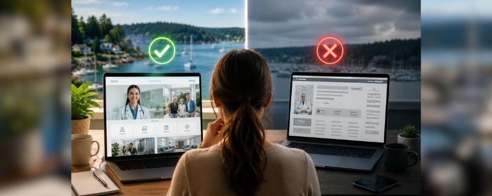
Section Three: Provider Credibility, The Human Layer That Drives Appointment Decisions
In the Gig Harbor healthcare market, where patient reviews consistently praise providers who “take the time to listen” and make patients feel “heard, valued, and well cared for” (as documented across Healthgrades and WebMD profiles for local physicians), the provider biography is one of the highest-impact trust signals on the entire website.
As per SPRY’s Clinical Website Trust Research, “real team photography, approachable headshots of staff with brief bios, creates a human connection that generic imagery cannot replicate. Treatment in action imagery, when ethically appropriate, provides social proof and sets patient expectations before the first appointment.”
A Gig Harbor patient choosing between an independent practice and a large health system is frequently choosing the human experience over the institutional one. They are not choosing MultiCare or St. Anthony because those systems are clinically superior. They are choosing them because the independent practice’s website failed to communicate what the independent practice actually offers, personal, attentive, relationship-based care from a provider who knows their name.
The provider biography page is where that communication happens. It should include a real photograph, not a formal credential portrait, but an image that communicates approachability, a specific description of the provider’s care philosophy, the types of patients they serve most effectively, and something genuine about why they practice in Gig Harbor specifically. When an About page reads like a curriculum vitae, it communicates credentials. When it reads like a person who genuinely cares about this community, it communicates trust.
As per Sayenko Design’s Healthcare Web Design Trends Report, “empathy is a cornerstone of quality healthcare, and digital platforms communicate this through authentic accounts from real individuals, clinician biographies, and supportive visual elements that help patients feel the human presence of the care team before they arrive.”
Section Four: The Appointment Path, Where Most Healthcare Websites Lose the Patient
A patient who has evaluated the practice, reviewed the provider’s biography, and decided they want to book an appointment represents the highest-value moment in the entire website journey. This is where most Gig Harbor healthcare websites make their most costly mistake.
As per Unicorn Platform’s Healthcare Conversion Analysis, there are three specific failure points that consistently cause patient abandonment at the booking stage. The first is trust timing, credentials and process transparency appear too late, so patients are asked to commit before confidence has been fully established. The second is pathway confusion, multiple equal-priority actions such as calling, chatting, scheduling online, and downloading forms are presented simultaneously without a clear primary path, causing patients to delay decisions rather than complete them. The third is operational opacity, if insurance acceptance, appointment format, response timing, and what to expect at the first visit are unclear, even a willing patient will pause.
The appointment booking path on a Gig Harbor healthcare website should be visible without scrolling, described in plain language, and structured around a single clear action. The patient who has decided to book should be able to complete that action in three steps or fewer. Each additional step is a point at which hesitation can undo a decision that required significant trust to reach.
As per the same research, “shorter initial forms usually increase completion without reducing quality when routing logic is well designed. Patients are more likely to complete forms when they understand why each field is requested, and setting clear post-submit expectations near the submit button, including when they will hear back and through which channel, directly reduces abandonment.”
For a Gig Harbor practice offering both in-person and telehealth appointments, the booking path should distinguish these options clearly and make the appropriate choice accessible from the first action, not buried in a navigation dropdown that requires three clicks to locate.
Section Five: Insurance Visibility and Telehealth, The Operational Signals That Convert
Two pieces of operational information consistently determine whether a Gig Harbor patient proceeds to booking or returns to the search results: insurance acceptance and telehealth availability. Both are under-displayed on the majority of independent practice websites in this market.
As per Net One Click’s Trust and Access Research 2026, “insurance visibility is among the most cited factors in patient conversion, a practice that accepts a patient’s insurance but does not display that clearly on its website loses that patient to a practice that does, even when clinical quality is identical.” For an independent Gig Harbor practice accepting a range of commercial insurance plans, displaying this information clearly, on the homepage, the services page, and the new patient page, is one of the simplest and highest-impact improvements available.
Telehealth availability is an equally underutilized competitive signal. According to the Gig Harbor medical landscape guide published by Living in Gig Harbor, many local healthcare providers now offer telemedicine services, yet the majority do not display this capability prominently on their websites. A practice that offers telehealth but does not make this immediately visible is leaving a significant advantage invisible to the patients who would choose it specifically for that reason.
MultiCare, for example, makes its same-day and next-day visit availability, including virtual options, among the most prominent features of its Gig Harbor practice page. Independent practices that match this level of operational clarity are making the decision to choose them significantly easier. Those that do not are inadvertently directing the patient’s decision toward the system that was clearer.
Section Six: Patient Reviews, The Trust Signal That Healthcare Operates On
Healthcare is unique among professional services in the degree to which patients rely on the experiences of others before making their own decision. This is not casual social proof. It is a primary research behavior that precedes the majority of new patient acquisition decisions.
As per SRH Web Agency, “you can tell patients how great your clinic is, but they will always trust other patients more. Integrating real patient success stories and testimonials directly onto your homepage can dramatically increase conversions, and displaying ‘Top Doctor’ awards, board certifications, and professional memberships serves as visual shorthand for expertise and safety.”
For a Gig Harbor practice, the reviews that carry the most weight are the ones that describe a recognizable personal experience. As documented across Healthgrades profiles for local Gig Harbor physicians, the reviews that consistently generate new patient inquiries describe providers who “addressed all concerns quickly and efficiently without wasting any time,” practices where patients never feel “rushed or a burden,” and care teams who demonstrate genuine attention to the individual patient’s situation.
These are not generic compliments about quality and service. They are specific confirmations of the personal care experience that a Gig Harbor patient is specifically looking for when choosing an independent practice over a large health system. A website that surfaces these reviews prominently, keeps them current, and presents them alongside clinical credentials creates a layered trust architecture that no single testimonial block can achieve on its own.
As per Unicorn Platform’s Healthcare Trust Research, “trust in healthcare is not created by one testimonial section. It is created by consistent evidence across page sections, using a layered trust model with provider credibility, process transparency, and communication reliability, with each layer answering a different patient concern.”
Section Seven: Mobile Performance, Security, and the Technical Signals That Patients Register Without Knowing It
A Gig Harbor healthcare provider whose clinical reputation is exceptional can lose a prospective patient in the three seconds it takes a poorly optimized website to load on a phone. This is not an exaggeration, it is a documented behavioral pattern that has direct consequences for patient acquisition.
As per SRH Web Agency’s 2026 Healthcare Design Report, “if your website takes more than three seconds to load, bounce rates skyrocket. For a healthcare provider, a slow website suggests inefficiency, and speed is not just a technical metric, it is a trust metric. Security is the backbone of any medical platform. Unlike a standard business website, a healthcare site often handles sensitive inquiry forms and personal health information.”
For the Gig Harbor healthcare demographic, which skews toward established professionals and older adults who have high expectations for the quality of every service they engage, a website that performs poorly on a phone or displays a browser security warning is not a minor technical inconvenience. It is a signal that contradicts everything the clinical quality of the practice represents. It communicates inattention. In a community where word-of-mouth reputation is built on consistent personal attention to detail, inattention on a website is a trust-destroying signal that most providers never see, because the patients it repels leave without comment.
As per Orbix Studio, “most patients browse on their phones. A healthcare website in 2026 must load quickly, work flawlessly on mobile devices, and provide appointment booking without unnecessary steps, and a slow or unresponsive site instantly reduces trust regardless of clinical quality.”
Private VIP Analytics represents a specific capability that addresses this problem with precision. Unlike standard analytics tools that report aggregate trends with a delay of 12 to 48 hours, Private VIP Analytics shows real-time visitor behavior, which pages patients are visiting, where they are hesitating in the booking process, whether the insurance information is being located before patients decide to leave, and whether the appointment form is being started and abandoned before completion. For a Gig Harbor practice where each new patient represents a long-term care relationship worth thousands of dollars in lifetime revenue, that level of visibility is the mechanism through which a website improves continuously rather than performing at a fixed level while competitors quietly take the patients it was failing to convert.
What a Gig Harbor Healthcare Website Must Accomplish, A Summary Framework
Before a Gig Harbor healthcare provider invests in a website, the following questions are worth answering honestly about their current site.
Does the first screen establish fit without scrolling? A patient should understand within three seconds whether this practice serves people like them, in Gig Harbor, with the care approach they are looking for. If that is not clear above the fold, the website is beginning with a failure.
Does the provider biography communicate a person, not a credential list? A Gig Harbor patient choosing an independent practice is choosing personal care. The About page is where that choice is either confirmed or undermined.
Is the appointment booking path a single, clear action? If a patient must navigate more than three steps to book, the website is creating friction at the moment of highest intent.
Is insurance acceptance clearly displayed on the homepage? If a patient must dig for this information, they will frequently assume the practice does not accept their plan and move on.
Does the website load in under three seconds on a phone? If it does not, the clinical quality of the practice is irrelevant to the patient who never reached the provider biography.
These are not aspirational standards. They are the minimum requirements for a Gig Harbor healthcare website that functions as a patient acquisition system rather than a digital placeholder.
The Competitive Reality for Independent Gig Harbor Practices
The large health systems in Gig Harbor, MultiCare, St. Anthony, Kaiser, have advantages in brand recognition, marketing resources, and digital infrastructure that independent practices cannot match through budget alone. What they cannot replicate is the personal, relationship-based care experience that draws patients specifically to independent providers.
The independent Gig Harbor practice’s website is where that advantage either becomes visible or disappears entirely.
A website that communicates genuine personal care, removes the uncertainty that causes patients to choose the familiar over the excellent, and guides a Gig Harbor patient from arrival to appointment booking through a clear and frictionless path is a competitive asset that no health system can replicate, because it reflects something the health system structurally cannot offer.
Most independent Gig Harbor healthcare websites are not currently built for that job. They are built to exist, to confirm the practice is real and provide a phone number. The distance between existing and competing is not a matter of clinical quality.
It is a matter of what the website does in the first thirty seconds of a patient’s visit.
Start with a Conversation, Not a Commitment
Hyper Effects builds websites for independent Gig Harbor healthcare providers that compete, not just with other independent practices, but with the large health systems whose digital resources they cannot match on budget alone. The approach begins with a clear understanding of how Gig Harbor patients make healthcare decisions, what they look for before they book, and what the website must accomplish before a patient ever picks up the phone.
If you would like an honest assessment of what your current practice website is doing, and where it may be losing the patients it should be converting, that conversation starts here. No commitment required. Just a specific, clear picture of where things stand.
Resources Referenced in This Post
- Net One Click, The 2026 Patient Journey: Click, Compare, Choose, netoneclick.com
- Unicorn Platform, Healthcare Web Design in 2026: Build Patient Trust Before the First Appointment, unicornplatform.com
- Unicorn Platform, Medical Website Design in 2026, unicornplatform.com
- Unicorn Platform, Healthcare Conversion Pages in 2026, unicornplatform.com
- SRH Web Agency, Top Healthcare Website Design Features for Clinics in 2026, srhwebagency.com
- Orbix Studio, Top Healthcare Website Design Agencies 2026, orbix.studio
- Sayenko Design, Healthcare Web Design Trends and How They Impact Patient Trust, sayenkodesign.com
- SPRY, Visual Trust Signals That Make or Break Healthcare Websites, sprypt.com
- Healthgrades, Best Primary Care Doctors Near Gig Harbor, WA, healthgrades.com
- WebMD, Best Family Physicians in Gig Harbor, WA, doctor.webmd.com
- Gig Harbor Chamber of Commerce, Healthcare Directory, gigharborchamber.net
- Living in Gig Harbor, Your Guide to Gig Harbor’s Medical Landscape, livingingigharbor.com
Related reading:
Trust Signals a Gig Harbor Website Must Have in 2026
The Real Question Is Not Whether AI Can Build Your Website. It’s Whether That Website Will Work.
What a Website Really Costs in Gig Harbor, And What It Returns
The 7 Silent Trust Checks Gig Harbor Customers Run on Your Website Before They Call