
Most business websites do not fail because the business is weak.
They fail because the website never earns the right to be explored.
If you have ever opened your own site and felt unsure whether it clearly explains what you do, you are not alone. Many business owners sense something is off but cannot put their finger on it.
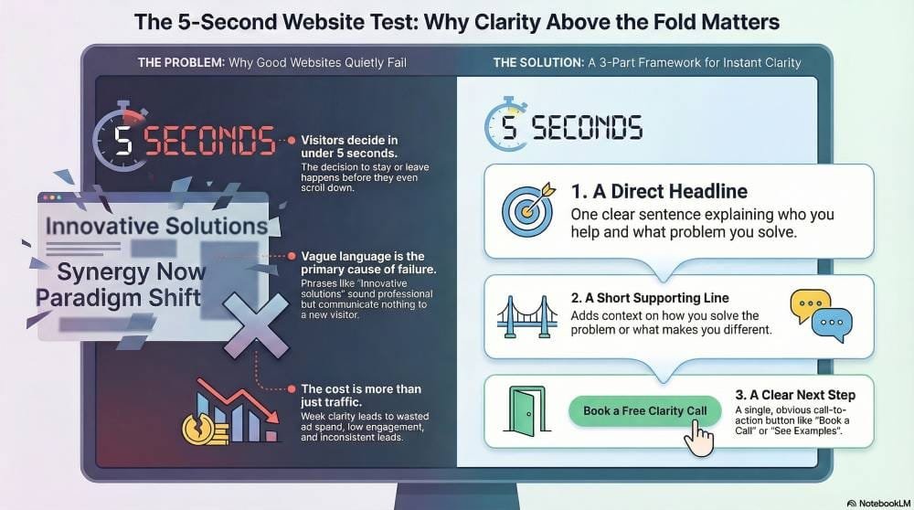
The uncomfortable truth is that visitors often decide whether to stay or leave before they even scroll. That decision happens fast, usually within five seconds.
This is not about short attention spans or impatient users. It is about clarity. When the top of a page does not immediately answer the visitor’s silent questions, they leave without frustration, without anger, and without telling you why.
That quiet exit is where most websites fail.
Why this keeps happening to good businesses
Above the fold means everything a visitor sees before they scroll. This space carries more responsibility than any other part of the page. Yet it is often treated as decoration instead of communication.
Many websites open with vague headlines, abstract slogans, or generic promises. Phrases like “We help businesses grow” or “Innovative solutions for modern companies” sound professional, but they do not mean anything to someone who just landed on your page.
This happens for understandable reasons. Business owners are close to their work. They know what they offer, so they assume the message is obvious. Designers focus on visuals. Developers focus on structure. Marketing copy gets softened to avoid sounding too direct.
The result is a page that looks polished but says very little.
Visitors arrive with a simple goal. They want to know where they are, whether this is for them, and what to do next. If those answers are not immediately clear, the brain defaults to leaving. Not because the site is bad, but because the effort feels higher than the reward.
What it costs when the first screen fails
When above-the-fold clarity is weak, traffic does not turn into conversations. Ads become expensive because visitors bounce. SEO underperforms because engagement signals stay low.
Even referrals lose value because people who were told to check you out cannot quickly understand why they should care.
This creates a frustrating loop. You invest time and money into your website, but it never seems to work as hard as it should. Leads feel inconsistent. Analytics show visitors arriving but not staying.
You may start questioning whether websites even work for your type of business.
The damage is not just technical. Over time, it affects confidence. Business owners start to feel invisible online. They blame algorithms, competition, or timing, when the real issue is that the website never clearly speaks for them in the first few seconds.
What clarity actually looks like in the first five seconds
Strong above-the-fold communication is not clever. It is considerate.
It respects the visitor’s time and mental energy. It removes guesswork. It says, clearly and calmly, “You are in the right place, and here is why.”
This clarity usually comes from three elements working together.
First is a direct headline. One sentence that explains exactly who the service is for and what problem it solves. Not a slogan. Not a mission statement. A plain-language explanation that a real person would say out loud.
Second is a short supporting line that adds context. This is where you explain how you help or what makes the approach different, without listing features or credentials.
Third is a clear next step. A button or action that tells the visitor what they can do now. Book a call. See examples. Get pricing. Learn how it works. The action should feel safe and logical, not demanding.
When these three elements are present, visitors relax. They stop scanning and start reading.
A practical framework to fix above-the-fold clarity
You do not need a full redesign to fix this. You need focus.
Start by answering one question only: what problem does my ideal customer want solved when they land here?
Write that answer in one sentence, using simple words. Avoid internal language. Avoid industry terms. Imagine explaining it to someone who knows nothing about your business.
Next, add one line that explains how you help solve that problem. Keep it grounded. This is not the place for big claims. It is the place for reassurance.
Then choose one primary action. Only one. Multiple buttons create hesitation. A single clear option creates momentum.
After that, look at the visual. The image or layout should support the message, not compete with it. Faces looking toward the text, real environments, or clear context often work better than abstract graphics.
Finally, remove anything that does not support clarity. Extra menus, sliders, long paragraphs, and rotating messages all dilute the first impression.
The goal is not to impress. The goal is to be understood.
Why this works even in crowded markets
Clear communication builds trust faster than clever branding. When someone immediately understands what you do and who it is for, they feel safer continuing.
This is especially important for service businesses, local providers, consultants, and professionals. People are not browsing for entertainment. They are trying to solve a problem. The website that helps them orient themselves quickly wins attention, even if competitors have bigger budgets or flashier designs.
Clarity also compounds over time. When visitors stay longer, search engines notice. When more people take the next step, conversion rates rise. When the website starts doing its job, other marketing efforts suddenly feel more effective.
Growth becomes easier not because you are pushing harder, but because friction has been removed.
A calmer way forward
If your website has not been performing, it does not mean your business is failing. It means the message has been doing too much work too late.
The first screen is not a summary. It is a handshake.
When you focus on helping visitors understand quickly and comfortably, everything downstream improves. You get better conversations, better data, and more confidence in your online presence.
Clarity is not about saying more. It is about saying the right thing first.
Once that is in place, growth stops feeling mysterious. It becomes something you can see, measure, and steadily improve.