Using Responsive Design to convert visitors into clients.
In today’s digital age, your website’s design directly impacts your business’s success. This is especially true for small businesses competing against larger corporations. Understanding why responsive design matters can significantly boost your conversions and propel your business forward.

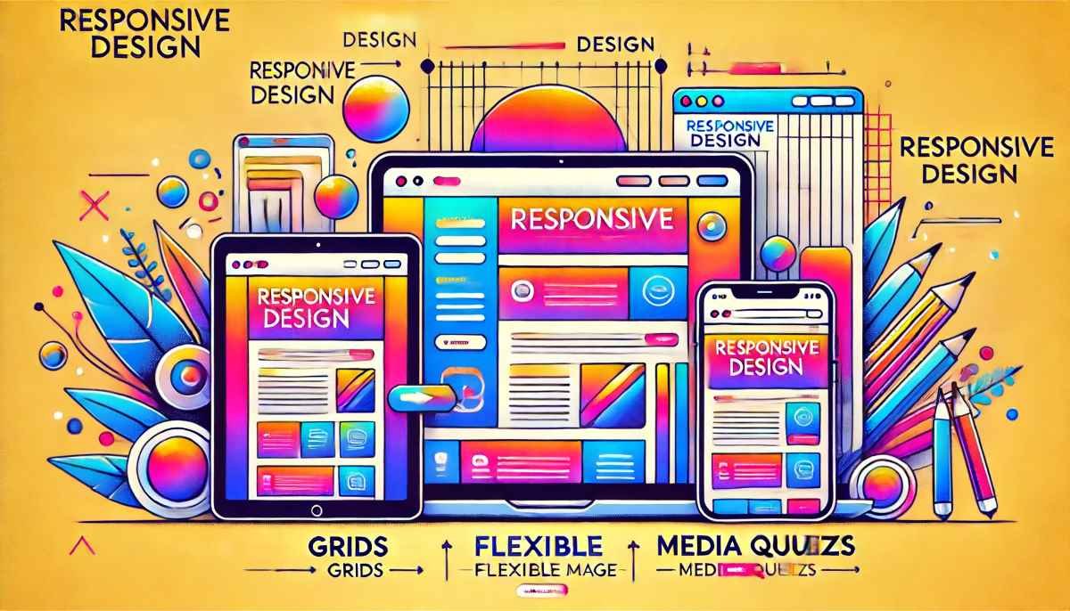
What is Responsive Design?
Responsive design ensures your website adapts seamlessly to various devices and screen sizes. From desktops to smartphones, your site must provide a consistent and user-friendly experience.
Imagine you have a shop that looks welcoming and easy to navigate, whether customers walk in through the front door or the side door. Responsive design is like making sure your online shop (your website) looks great and works smoothly no matter how people visit it.
Responsive design means your website automatically adjusts and looks good on any device people use. This could be a big desktop computer, a laptop, a tablet, or a smartphone. Just like you want your physical shop to be inviting and easy to navigate for everyone, you want your website to offer a pleasant experience for all visitors, no matter what device they’re using.
Here’s why it’s important:
- Consistency: Whether someone is browsing your site on a computer at home or on their phone while on the go, they should have a similar, easy experience.
- User-Friendly: A responsive website makes it simple for visitors to find information, make purchases, or contact you, which keeps them happy and encourages them to stay longer and come back again.
- Professional Appearance: Just like a well-organized shop makes a good impression, a well-designed website shows that your business is professional and cares about its customers.
In short, responsive design is about making sure your website is flexible and looks great on all types of devices, providing a consistent and user-friendly experience for everyone who visits.

First Impressions Count
Users form opinions about your website within seconds. If your site isn’t responsive, visitors may leave quickly, increasing your bounce rate and losing potential customers. Imagine walking into a store for the first time. If the store is messy and hard to navigate, you might leave quickly without buying anything. The same thing happens online.
When someone visits your website, they decide within seconds if they want to stay. If your website doesn’t look good or work well on their device, they’ll leave. This is called a high bounce rate, which means people visit your site but leave almost immediately.
A responsive website adapts to any device, whether it’s a phone, tablet, or computer. This makes your site look professional and easy to use, encouraging visitors to stay longer and explore what you offer. Keeping visitors on your site increases the chances they’ll become customers. So, making a good first impression with a responsive design is crucial for your business success.

Enhancing User Experience
Responsive design improves user experience by making navigation easy and intuitive. When users find it simple to browse, they stay longer and are more likely to convert.
Responsive design means your website adjusts to fit any screen size, whether it’s a phone, tablet, or computer. This makes it easy for visitors to find what they are looking for, no matter what device they are using.
Simple and Intuitive: When your website is easy to use, people enjoy their experience more. They don’t have to struggle to read text, find links, or scroll sideways. Everything fits perfectly on their screen, making it simple to browse.
Longer Visits: When visitors have a pleasant experience on your website, they stay longer. They explore more pages, learn more about your products or services, and are more likely to become customers.
In short, a responsive design makes your website user-friendly, which keeps visitors happy and increases the chances they will buy from you.

SEO Benefits
Google prioritizes mobile-friendly websites. A responsive design boosts your search engine rankings, making it easier for potential customers to find you.
What is SEO? SEO stands for Search Engine Optimization. It’s the process of making your website more visible on search engines like Google. The better your SEO, the higher your site appears in search results.
Why Does Google Prioritize Mobile-Friendly Websites? Google wants to give users the best experience possible. Since many people use their phones to search the web, Google prefers websites that work well on mobile devices. If your website isn’t mobile-friendly, it might not rank as high in search results.
How Does Responsive Design Help? Responsive design means your website looks and works great on all devices—desktops, tablets, and smartphones. Here’s how it boosts your SEO:
- Higher Rankings: Google rewards mobile-friendly websites by placing them higher in search results. This makes your business more visible to potential customers.
- Better User Experience: When users have a positive experience on your site, they stay longer and explore more pages. Google notices this and ranks your site higher because it sees that users find your site valuable.
- Reduced Bounce Rate: A bounce rate is the percentage of visitors who leave your site after viewing only one page. If your site isn’t mobile-friendly, users are likely to leave quickly, increasing your bounce rate. A responsive design keeps users engaged, lowering your bounce rate and improving your SEO.
In Simple Terms: Think of Google as a matchmaker. It wants to connect users with the best websites. By making your site responsive (mobile-friendly), you’re telling Google, “My site is ready to give users a great experience.” As a result, Google is more likely to show your website to potential customers when they search for products or services you offer.
So, by having a responsive design, you’re making it easier for customers to find you online. This can lead to more visits, more engagement, and ultimately, more sales for your small business.

Real-Life Impact
Consider a local bakery that redesigned its website to be responsive. The result? A 40% increase in online orders within three months. This isn’t an isolated case; countless small businesses see significant improvements with responsive design.
Let’s take a simple example to understand how important responsive design is for your business. Imagine you own a small bakery in your town. You decide to redesign your website to make it look good and work well on any device, whether it’s a phone, tablet, or computer. This is what we call making your website “responsive.”
After you make your website responsive, something amazing happens. Within three months, you see a 40% increase in online orders. That means more people are buying your cakes, cookies, and other baked goods directly from your website.
Why did this happen? When your website is easy to use on any device, more people can find you and order from you. They don’t get frustrated trying to navigate a hard-to-use website. They can easily see your products, place orders, and make payments right from their phones or tablets.
This bakery example is not unique. Many small businesses that make their websites responsive see similar improvements. They get more customers, more sales, and more engagement simply because their websites work well on all devices.

The Mobile Revolution
With over half of global web traffic coming from mobile devices, ignoring responsive design means alienating a massive audience. Ensure your site performs well on mobile to capture these users.
Imagine that more than half of the people who visit websites around the world are using their phones or tablets instead of desktop computers. This shift is known as the “Mobile Revolution.”
For small business owners, this means it’s crucial to make sure your website looks good and works well on these mobile devices. If your site isn’t mobile-friendly, you risk losing a huge number of potential customers.
Here’s why it matters:
- Widespread Mobile Usage: Most people now use their phones to browse the internet. If your website doesn’t work well on a phone, visitors will quickly leave and find a site that does.
- User Experience: A mobile-friendly site is easy to read and navigate. This makes visitors happy and encourages them to stay longer and engage with your content or products.
- Customer Reach: By ensuring your site works well on mobile devices, you can reach a broader audience. Ignoring mobile users is like closing your shop to half of your potential customers.
What You Should Do
- Responsive Design: Make sure your website adjusts automatically to fit any screen size. This is called responsive design. It ensures your site looks great whether someone is using a phone, tablet, or computer.
- Easy Navigation: Simplify your website’s menu and layout for mobile users. Big buttons, readable text, and straightforward navigation help users find what they need quickly.
- Fast Loading: Mobile users expect fast-loading sites. Optimize your images and content to load quickly, keeping visitors from getting frustrated and leaving your site.
The Impact
When your site is mobile-friendly:
- Visitors are more likely to stay and explore.
- They can easily find and buy your products or services.
- You build a positive reputation, as customers appreciate a smooth and hassle-free experience.
By focusing on responsive design, you open your business to a vast audience of mobile users, helping you grow and succeed in today’s digital world.
Boosting Conversion Rates
A responsive design makes the buying process smoother, reducing friction points. When customers can easily navigate and purchase from any device, conversion rates soar.
A responsive design makes it easier for people to buy from your website. Imagine walking into a store where everything is neatly organized and easy to find. You’d probably enjoy your shopping experience and might even buy more.
Here’s how it works:
- Smooth Navigation: A responsive website adjusts to fit any device, whether it’s a computer, tablet, or smartphone. This means your site will look good and be easy to use, no matter what device your customers are using.
- Easy Purchase Process: When your website is easy to navigate, customers can quickly find what they want to buy. They won’t get frustrated or confused, which makes them more likely to complete their purchase.
- Reduced Friction Points: Friction points are obstacles that make it hard for customers to buy from you. For example, if a button is too small to click on a phone or if the checkout process is too complicated. A responsive design removes these obstacles, making the buying process smooth and enjoyable.
- Increased Sales: When customers have a positive experience on your website, they are more likely to make a purchase. This means more sales and higher conversion rates for your business.
By making your website responsive, you ensure that all your customers have a pleasant and easy shopping experience, no matter how they access your site. This leads to more completed purchases and ultimately, more sales for your business.

Building Trust
A professional, responsive website builds trust. Users associate a well-designed site with credibility and reliability, making them more likely to choose your business over competitors.
Why Trust Matters
When people visit your website, their first impression is crucial. A well-designed, professional website can make a big difference in how they perceive your business.
The Role of a Responsive Website
A responsive website adapts to any device, whether it’s a computer, tablet, or smartphone. This means it looks good and works well no matter how people are accessing it.
Credibility and Reliability
When your website looks polished and functions smoothly, visitors see your business as credible and reliable. This builds trust, making them feel confident about choosing your services or products.
Choosing You Over Competitors
People tend to prefer businesses they trust. If your website is easy to navigate and visually appealing, visitors are more likely to pick your business over others with less professional sites.
Simple Example
Imagine you walk into two stores: one is clean, organized, and welcoming, while the other is messy and hard to navigate. You’re likely to trust and buy from the first store. The same applies to websites.
By having a professional and responsive website, you show potential customers that you are trustworthy and reliable, increasing the chances they will choose you over competitors.

Staying Ahead of the Competition
Many small businesses still lack responsive websites. By investing in responsive design, you gain a competitive edge, attracting more customers who prefer mobile-friendly sites.
Many small businesses do not have websites that work well on all devices. This means their websites may look good on a computer but not on a smartphone or tablet.
By making sure your website is responsive, you make it look and work great on any device. This is important because more and more people are using their phones to browse the internet.
When your website is easy to use on a phone, more people will stay on your site and are more likely to become customers. This gives you an advantage over competitors who don’t have responsive websites.
Investing in a responsive design helps you attract these mobile users, making your business more appealing and accessible. This way, you can gain more customers and stay ahead of businesses that haven’t adapted to this important trend.
Cost-Effective Solution
Maintaining one responsive website is more cost-effective than managing separate sites for desktop and mobile. This efficiency saves time and resources, crucial for small businesses.
Maintaining a responsive website is a smart way to save money and time, especially for small businesses.
What is a Responsive Website?
A responsive website is one that automatically adjusts to look good on any device, whether it’s a desktop computer, a tablet, or a smartphone.
Why is it Cost-Effective?
- One Website, Multiple Devices: With a responsive website, you only need one site that works well on all devices. Without it, you would need separate websites for desktop and mobile users. Creating and maintaining two sites costs more money and time.
- Easier Maintenance: Updating a responsive website is easier because you make changes in one place, and those changes apply to all devices. This means you spend less time and money on updates and fixes.
- Better Investment: The initial cost of creating a responsive website might be a bit higher, but it saves you money in the long run. You won’t have to pay for two separate sites or double the maintenance work.
Why is This Important for Small Businesses?
- Limited Budget: Small businesses often have limited budgets. Saving money on website maintenance allows you to invest in other important areas, like marketing or improving your products and services.
- Resource Efficiency: With fewer resources needed for website upkeep, you can focus more on growing your business. This efficiency is crucial for small businesses trying to compete with larger companies.
In summary, a responsive website is a cost-effective solution because it reduces the need for multiple sites, simplifies maintenance, and saves both time and money. This efficiency is especially beneficial for small businesses looking to make the most of their resources.

Future-Proofing Your Business
As technology evolves, responsive design ensures your website remains functional across new devices and screen sizes. This adaptability keeps your business relevant and accessible.
As a small business owner, it’s essential to keep your business adaptable to changes in technology. Here’s a simple way to understand why responsive design is crucial for this adaptability:
What is Future-Proofing?
Future-proofing means preparing your business to handle new challenges and changes, especially in technology. It ensures your business stays relevant and accessible, no matter how technology evolves.
The Role of Responsive Design
Responsive design helps your website automatically adjust to fit any device or screen size. Whether someone visits your site on a smartphone, tablet, or desktop computer, it looks and works perfectly.
Why It Matters
- Technology Changes Fast: New devices with different screen sizes are released regularly. Without responsive design, your website might not work well on these new devices.
- Reach More Customers: People use a variety of devices to browse the internet. If your site works well on all devices, you can attract and keep more customers.
- Save Time and Money: Instead of creating and maintaining multiple versions of your website for different devices, responsive design allows you to have one website that works everywhere. This is more efficient and cost-effective.
An Example
Imagine a customer trying to visit your website on their new tablet. If your site isn’t responsive, they might struggle to navigate, read content, or make a purchase. Frustrated, they might leave and visit a competitor’s site.
With responsive design, your website will automatically adjust to fit the tablet screen perfectly, making it easy for the customer to interact with your business.
Responsive design future-proofs your business by ensuring your website remains functional and user-friendly across all current and future devices. This adaptability helps your business stay relevant, attract more customers, and save money on website maintenance.
Final Thoughts: Why Responsive Design is Essential for Your Small Business
Responsive design isn’t just a new fad; it’s essential for the success of your small business. Let’s break down why this is so important:
- Enhancing User Experience: Responsive design makes sure your website looks good and works well on any device, whether it’s a smartphone, tablet, or computer. When visitors find your site easy to use, they’re more likely to stay longer and take action, like making a purchase or contacting you.
- Boosting SEO (Search Engine Optimization): Search engines like Google rank mobile-friendly websites higher in search results. If your site is responsive, it’s more likely to show up when people search for products or services you offer. This means more potential customers can find you.
- Increasing Conversions: “Conversions” refer to the actions you want visitors to take on your site, like buying something or signing up for a newsletter. A responsive design makes it easier for users to navigate and complete these actions, leading to higher sales and more engagement.
By adopting responsive design, you’re setting your business up for growth. It helps you reach more people and provides them with a great experience, no matter what device they use.
In a world where more and more people use mobile devices to browse the internet, having a responsive website ensures that your business stays relevant and accessible.
Remember, the secret to boosting your sales and achieving success lies in making sure your website is user-friendly on all devices. Embrace responsive design, and watch your business thrive!