
If this thought has crossed your mind, you are not alone. Many established business owners feel a quiet disconnect when they look at their website. In real life, your business feels solid, capable, and trusted. Online, it feels reduced. Less confident. Less established. That gap creates frustration because it does not match reality.
This feeling usually appears when leads hesitate, ask basic trust questions, or treat your business like it is still getting started. It is uncomfortable because you know the work you do is better than what your website suggests. This is not about insecurity. It is about misalignment between perception and reality.
Why this problem keeps happening
Most websites are built to exist, not to position a business properly. Many are launched quickly, using templates and generic messaging, then left untouched while the business grows.
As per Stanford Web Credibility Research and https://credibility.stanford.edu, users form trust judgments about a website in seconds, largely based on visual design and structure, not deep content.
When a site looks generic or unclear, visitors subconsciously assume the business behind it is small, new, or inconsistent. This happens even if the opposite is true.
Another issue is owner centered messaging. Statements like “we provide quality service” feel safe but say very little. They force visitors to guess what makes the business different or experienced.
As per Nielsen Norman Group and https://www.nngroup.com/articles/trustworthiness-guidelines, vague claims reduce perceived credibility because users rely on concrete signals, not promises.
Finally, businesses evolve faster than their websites. Experience grows. Client expectations rise. The website stays frozen. Over time, the gap widens.
The real cost of looking smaller online
This problem rarely shows up as a clear rejection. Instead, it creates silent losses.
You attract price focused inquiries instead of serious clients.
You spend calls explaining credibility instead of solving problems.
You lose prospects who never reach out at all.
As per Google UX Research and https://www.thinkwithgoogle.com/consumer-insights/consumer-trends/website-user-experience-statistics, users are far more likely to abandon a business if the website feels outdated, confusing, or unprofessional.
Over time, this erodes momentum. Not because your business is weak, but because the first impression does not reflect your actual strength.
What credibility really looks like online
Credibility is not about flashy design or sounding big. It is about removing doubt.
Visitors ask three silent questions the moment your site loads.
Is this business legitimate
Does this business know what it is doing
Is this business right for someone like me
If your website does not answer these quickly, people move on.
As per Stanford Web Credibility Research and https://credibility.stanford.edu, visual clarity and information structure matter more than detailed explanations when it comes to trust.
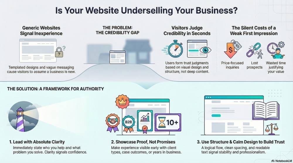
A practical framework to elevate perceived authority
You do not need to exaggerate your business. You need to represent it accurately.
1. Start with clarity, not cleverness
Your main message should immediately explain who you help and what problem you solve. Avoid slogans that sound nice but say nothing.
As per Nielsen Norman Group and https://www.nngroup.com/articles/homepage-usability, users rely on clear headlines to decide whether a site is relevant within seconds.
Clear language signals confidence.
2. Make proof visible early
Experience should not be hidden deep in the site. Years in business, recognizable client types, case outcomes, or third party mentions reduce uncertainty fast.
As per Stanford Web Credibility Research and https://credibility.stanford.edu, showing real world signals of legitimacy increases trust far more than marketing claims.
3. Organize content like a guide
Strong businesses feel structured. Pages should flow logically. Problems should be acknowledged before solutions are presented.
As per Nielsen Norman Group and https://www.nngroup.com/articles/information-architecture, clear structure increases user confidence and reduces confusion.
Organization signals stability.
4. Design for calm and focus
Overcrowded layouts and inconsistent visuals create doubt. Clean spacing, readable text, and visual hierarchy help users feel at ease.
As per Google UX Guidelines and https://web.dev/learn/design, simple and consistent design improves perceived quality and trust.
Calm design feels confident.
5. Speak to the client you actually serve
If your ideal clients are experienced, your language should reflect that. Avoid beginner explanations if your audience is not beginner level.
As per Think with Google and https://www.thinkwithgoogle.com/consumer-insights/consumer-journey, relevance increases trust and engagement.
Being specific feels experienced.
6. Make reaching out feel natural
A strong website makes contact feel expected, not risky. Clear calls to action and reassuring context reduce hesitation.
As per Nielsen Norman Group and https://www.nngroup.com/articles/form-design-placeholders, simple forms and clear intent increase completion rates.
Ease builds trust.
If your website looks fine but still doesn’t get calls, this is usually why:
Most business websites fail before the first scroll, long before visitors understand what you offer.
Why this approach changes outcomes
When your website aligns with who your business truly is, everything shifts.
Inquiry quality improves
Sales conversations become smoother
Pricing resistance decreases
As per Google Consumer Behavior Research and https://www.thinkwithgoogle.com/marketing-strategies/experience-design/building-consumer-trust, trust built early shortens decision cycles.
Your website stops being a liability and starts acting as a silent partner.
A grounded way to move forward
If your website makes your business look smaller than it is, nothing is broken. It simply means your growth has outpaced your positioning.
This can be corrected without hype, exaggeration, or pretending to be something you are not. Alignment is the goal.
Once your site reflects your real experience and clarity, the confusion disappears. The frustration lifts.
You stop guessing.
You understand what is wrong.
And you know exactly what to do next.
If your website no longer reflects the level you are operating at, take a quiet moment to look at it through a new visitor’s eyes. Small, intentional changes can shift how your business is perceived far more than you might expect. Start by clarifying what you want people to understand about you in the first few seconds. Once that is clear, everything else becomes easier to align.