
Website Not Working for My Business Here’s What’s Really Going Wrong
I’ve had this conversation more times than I can count.
A business owner sits across from me and says something like,
“My website isn’t broken. It loads fast. People can see it. But… it’s not really helping.”
That pause at the end matters.
Because most websites don’t fail loudly. They don’t crash or throw errors. They quietly exist. They look fine. They technically work. And yet, they don’t move the business forward.
If you’ve ever felt unsure whether your website is actually pulling its weight, you’re not imagining it. Your website might be working — just not in the way you need it to.
Let me explain what that usually means.
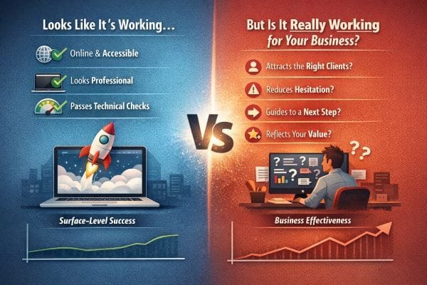
What “Working” Really Means (And Who It’s Working For)
When someone tells me, “Our website is working,” I’ve learned to ask one gentle follow-up:
“Working for who?”
Because most people mean one of three things:
- It’s online and accessible
- It looks professional enough
- It passes basic technical checks
Those are real wins. I never dismiss them. A broken site, a slow site, or a messy mobile experience can absolutely hurt you. Google has also made it clear that usability and performance matter, especially on mobile, through its Search Central guidance and Core Web Vitals resources.
But here’s what I see in the real world, over and over.
A website can “work” in the technical sense and still fail in the business sense. Not because the design is ugly or because SEO is missing. It fails because it’s doing its job for the wrong goal.
The 3 types of “working” I see most often
1. It’s working like an online brochure
This is the most common. The site describes services, lists a phone number, has a few photos, and maybe a contact form.
The problem is not that brochure sites are “bad.” The problem is that many businesses expect brochure sites to behave like sales systems.
If a site is built to inform, but you’re expecting it to persuade, you’ll feel like something is off. You’ll get visitors, but fewer contacts than you expected. Or you’ll get contacts that don’t match your ideal customer.
2. It’s working for the business owner, not the customer
This is the one people don’t see until we talk it through.
Owners know what they mean. They know their services. They know their process. So the website feels obvious to them.
A first-time visitor doesn’t have that context. They’re scanning quickly and silently asking:
- Am I in the right place?
- Can I trust this business?
- What happens if I reach out?
- How do I take the next step?
If the site doesn’t answer those questions fast, it still “works,” but not for the person you need it to work for.
This aligns with what usability research has shown for years: people scan, they decide quickly, and clarity matters more than cleverness.
3. It’s working for search engines, not conversions
This is the sneakiest one.
Sometimes I audit a site and the basics look solid:
- Decent load time
- Pages indexed
- Some rankings
- A steady trickle of traffic
And yet the business owner says, “It’s not bringing in leads.”
That’s because rankings and leads are not the same achievement.
Traffic is attention. Leads are trust plus direction.
If the page is optimized to rank for broad terms but doesn’t match the visitor’s intent, it will attract the wrong people or the wrong stage of buyer. The website isn’t failing. It’s doing what it was built to do, which is bring in traffic. It just wasn’t built to convert that traffic into real conversations.
The “working” test I use in practice
When I’m trying to determine whether a site is working in the way a business needs, I look for signals that show the site is doing more than existing.
I ask:
- Can a first-time visitor understand what you do in 5 seconds?
- Is there one clear next step, or five competing options?
- Does the page reduce uncertainty, or just provide information?
- Do the words sound like a real business, or like a template?
- Does the site guide people to act, or does it hope they’ll figure it out?
When those answers are weak, the site usually feels “fine” but performs like a quiet employee who never speaks to customers.
Why this distinction matters for SEO too
This is the part many people miss.
Google isn’t only rewarding pages that are technically correct. Google also tries to reward pages that satisfy the user, which shows up in engagement patterns over time. That’s a big reason the line between SEO and usability has blurred. Helpful content that matches intent and solves the searcher’s problem tends to perform better long-term.
So yes, “working” includes performance and indexation.
But if the website doesn’t create clarity, trust, and momentum, it’s not working the way your business needs.
And that’s usually the real issue hiding behind the sentence, “Our website is working… I think.”
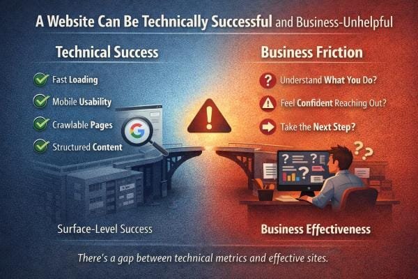
A Website Can Be Technically Successful and Business-Unhelpful
I’ve audited plenty of websites that look great on paper.
They load fast.
They pass Core Web Vitals.
They’re mobile-friendly.
They have clean code, indexable pages, and even decent rankings.
From a search engine standpoint, those sites often check the boxes Google publicly talks about: performance, mobile usability, and a crawlable structure.
And yet the business owner tells me the same thing every time:
“People visit, but nothing happens.”
That’s the moment where it helps to separate two ideas that get mixed up all the time:
Technical success and business success are not the same outcome.
What technical success really buys you
Technical health is like having a clean, well-lit storefront.
It makes it possible for customers to walk in.
It reduces friction.
It prevents obvious problems.
But it doesn’t make anyone buy.
A fast website does not automatically become a persuasive website.
A crawlable website does not automatically become a clear website.
Technical improvements raise your ceiling. They don’t guarantee results.
Why the “perfect” website still doesn’t perform
When a technically strong website feels business-unhelpful, it’s usually because the site fails at one of these human moments:
1. The first 5 seconds
Visitors arrive and immediately try to answer:
- Am I in the right place?
- Is this for someone like me?
- Can I trust this?
If the headline is vague, the design feels generic, or the page opens with “Welcome to our website,” people leave. Not because the site is slow, but because the meaning is slow.
2. The “what happens next” gap
A lot of websites offer a contact form, but they don’t explain what happens after someone clicks it.
People hesitate when they don’t know:
- How quickly you respond
- Whether it’s a sales call
- What you’ll need from them
- What the process looks like
This is one of the simplest conversion fixes, and it’s almost always missing.
3. The trust signal problem
A website can be technically clean and still feel emotionally risky.
Trust isn’t one thing. It’s a stack:
- Clear positioning
- Real examples of work
- Specific services
- Real location cues
- A professional tone that still feels human
- Easy-to-find contact info
- Consistency across pages
When trust signals are weak, people don’t reach out. They keep looking.
4. The “too many choices” problem
A site can be beautifully built and still overwhelm visitors.
I often see navigation menus with 10 to 15 items, multiple calls-to-action competing on the same page, and big blocks of text that bury the main point.
Visitors don’t read websites like a book. They scan. If the path isn’t obvious, they bounce.
The metrics trap I see all the time
Technical metrics are measurable, so people fix them first. That’s normal.
But here’s the trap:
A business invests time improving speed and SEO basics, sees traffic rise slightly, and expects leads to rise too.
Then nothing changes, and they assume:
- “SEO doesn’t work,” or
- “My market is too competitive,” or
- “People just don’t use websites anymore.”
Usually, the real issue is simpler.
The site attracts visitors but doesn’t guide them to act.
Traffic without direction is like foot traffic walking past your store because the signage is unclear.
What I look for when a site “should” be converting but isn’t
When I review a site like this, I stop thinking like a developer or an SEO tool. I think like a first-time customer.
I check:
- Does the headline say what you do in plain language?
- Do you explain who you help without sounding generic?
- Can I find pricing ranges, starting points, or at least what affects cost?
- Do you show proof in a way that feels real, not staged?
- Does the page answer objections before I feel them?
If the page fails these, it can still pass every technical test and still underperform.
Where SEO and usability meet
Google’s guidance focuses on making pages usable and helpful.
That’s why the gap matters.
When users land, feel uncertain, and leave, the page may still rank, but it struggles to become a lead generator. Over time, sites that satisfy intent and keep users engaged tend to have a stronger foundation.
That’s the real difference between:
- A website that is technically “good”
- A website that is practically useful for business growth
Page speed, mobile usability, crawlability, and structured content matter. They keep the door open.
But none of them guarantee that a visitor will:
- understand what you do
- feel safe reaching out
- take the next step
That’s the part that requires strategy, messaging, and trust-building design.
And that’s exactly where many websites quietly fall short, even when they look perfect in a performance report.
Your Website Might Be Helping the Wrong Audience
This is one of the most common problems I see, and it’s also the one that confuses business owners the most.
Because on the surface, things look “good.”
You have traffic.
You might even have inquiries.
You might even hear, “Oh yeah, I found you online.”
But the leads feel off.
They ask for discounts when you’re premium.
They want something you don’t even offer.
They’re in the wrong city.
They ghost after one message.
That’s not a visibility problem. That’s an alignment problem.
What misalignment looks like in real life
When a website attracts the wrong audience, it usually shows up in patterns like:
- Price-first conversations
The first question is “How much?” before they even understand the value. - Wrong location leads
People reach out from outside your service area, or they assume you travel farther than you do. - Wrong expectation leads
They expect a quick messagingfix, a cheap package, or something closer to a commodity than a professional service. - High bounce, low engagement
People land on the page, skim quickly, and leave. They aren’t confused, they’re just not the right fit.
If you’re seeing these, your website is not failing. It’s doing its job. It’s just doing the job of a wide net, not a smart filter.
Why websites drift into “wide net” mode
Most business owners build their first website with a totally understandable mindset:
“I don’t want to turn anyone away.”
So the website ends up saying things like:
- “We do it all”
- “We serve everyone”
- “Quality work at affordable prices”
- “Contact us for a quote”
That language feels safe. It feels polite. It feels inclusive.
But it also attracts people who are shopping for the lowest price and fastest turnaround, because nothing on the page tells them otherwise.
A website can’t be clear and vague at the same time. Vagueness always pulls in the wrong crowd.
The hidden cost of the wrong audience
Here’s what misalignment costs, even when you’re getting leads:
- Time spent replying to people who were never a fit
- Emotional fatigue from constant “cheap” conversations
- Calendar clutter that pushes out better opportunities
- A creeping feeling that online leads “don’t work”
The real tragedy is that you might assume demand is low, when the real issue is that your website isn’t speaking to the people you actually want.
How I diagnose this quickly
When I review a website for alignment, I look at a few things right away:
1. The headline and first screen
Does it instantly tell me:
- who you help
- what you do
- what kind of service this is
Or is it so general that anyone could claim it?
If the first screen could be swapped with a competitor’s site and still make sense, it’s too broad.
2. The language that signals price level
Premium businesses often accidentally write budget language.
Examples of budget signals:
- “Affordable” everywhere
- “Best prices”
- “Cheap” comparisons
- “Get a quote” with no context
Premium clients don’t need to be sold on cheap. They need to be reassured on quality, reliability, and outcomes.
3. Geographic clarity
If you serve a specific area, the website needs to say it clearly and naturally.
If location is vague, people will assume you serve everywhere. That leads to out-of-area inquiries and frustration on both sides.
4. The proof you choose
If your proof is generic, your leads will be too.
Real alignment happens when your examples, testimonials, and work samples match the type of client you want more of.
If you want higher-end clients, show higher-end work and higher-end outcomes.
Why “generic messaging” creates generic leads
This is the simplest rule I can give you:
Generic message in. Generic lead out.
When a website sounds like:
- any agency
- any contractor
- any consultant
It attracts people who treat the service like a commodity.
And commodity shoppers usually care about one thing: price.
If you want better leads, you don’t need louder marketing. You need sharper positioning.
What to change so your website attracts the right people
You don’t need to become pushy. You just need to become clear.
Here are the adjustments that usually fix misalignment:
Make your audience visible
Say who you’re for, in plain language.
Not a niche statement that feels forced, but a clear “we’re built for this.”
Be specific about what you do and don’t do
This is one of the strongest filters.
When you politely clarify boundaries, you attract people who respect them.
Replace “affordable” with “fit”
Instead of begging people to see you as affordable, show them why you’re the right fit:
- process
- timelines
- quality signals
- what working together feels like
Add a “before you reach out” section
A simple section like:
- “Here’s who we’re best for”
- “Here’s what you can expect”
- “Here’s a typical starting point”
reduces low-quality inquiries fast.
If your website is attracting the wrong people, it doesn’t mean your market is bad. It usually means your website is being polite when it needs to be specific.
Traffic and inquiries are not the goal.
Aligned inquiries are the goal.
And when your messaging becomes sharper and more honest, something interesting happens.
You often get fewer inquiries at first.
But the ones you get feel easier, more respectful, and far more likely to turn into real business.
That’s when your website starts working for you, not just for “everyone.”
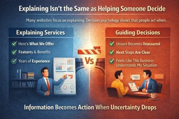
Explaining Isn’t the Same as Helping Someone Decide
A lot of websites are built to explain.
They list services.
They describe features.
They talk about years of experience.
They show a portfolio.
They add a few testimonials and call it done.
That kind of information matters, but it is not what makes someone choose you.
In real projects, I’ve seen the same pattern over and over. Two businesses can offer the same service at a similar price. One website gets calls. The other gets “I’ll think about it” and silence. The difference is rarely the service list. It is whether the website reduces uncertainty fast enough for a real person to feel safe taking the next step.
People don’t decide based on information alone. They decide when uncertainty drops.
When someone lands on your site, they are not only asking, “What do you do?”
They are also silently asking:
- Am I going to waste my time reaching out?
- Are you going to understand what I actually need, or will this turn into a generic sales pitch?
- How much effort is this going to take from me?
- What will this cost, and is there a catch?
- What happens after I click, call, or book?
- What could go wrong, and how do you handle it?
Most websites answer the first question and ignore the rest. That’s why they “look fine” but still don’t convert.
User experience research and decision psychology keep pointing to the same truth: people move when they feel oriented and reassured. Not hyped, not impressed, oriented. The job of a high-performing website is to create that orientation quickly.
In practice, this comes down to three conversion drivers that strong sites build into the page, not just into the copy.
1) Reassurance that feels specific, not generic
People trust specificity. “Trusted” and “high quality” are invisible claims. What lowers uncertainty is concrete proof that matches the visitor’s situation.
Examples that actually work:
- Naming who you help in plain language, not industries as labels
“Family-run dental clinics with two to five chairs” beats “healthcare businesses.” - Showing the kinds of outcomes people care about
“Reduce no-show appointments” or “turn quote requests into booked jobs.” - Calling out common fears directly
Timelines, surprise fees, getting stuck with a site they cannot edit, slow support, vague deliverables.
When a visitor feels “This is written for someone like me,” their brain stops scanning for exits.
2) Clear next steps that remove decision friction
A surprising number of websites lose customers because the next step is foggy. People do not want to negotiate the process. They want to know what they are agreeing to before they raise their hand.
What reduces uncertainty here is a visible path:
- Step 1: Quick call to confirm fit
- Step 2: You review their current site or goals
- Step 3: They receive a plan with timeline and pricing range
- Step 4: Build, review, launch, support
Even better when you add “what I need from you” and “what you get from me.” That turns the unknown into a sequence. Sequences feel safe.
In my experience, once you make the process concrete, you get fewer low-quality inquiries and more serious ones. The right visitors finally feel confident enough to act.
3) Emotional validation that proves you “get” them
This is the part most businesses avoid, because it feels less technical. But it is often the deciding factor.
People want to feel understood before they want to feel educated.
If your visitor is a small business owner, they are likely carrying some combination of:
- time pressure
- past disappointment with marketing vendors
- fear of wasting money
- confusion about what matters
- embarrassment about not knowing the “right” terms
A website that speaks to those realities gently, without shaming, builds trust faster than any feature list.
A simple line like “If you’ve paid for a website before and still ended up with no leads, you’re not alone” can outperform paragraphs of credentials, because it reduces a very specific kind of uncertainty: “Will this be another mistake?”
A website can explain everything and still fail to guide anyone toward a decision.
Because the goal is not to inform. The goal is to reduce uncertainty.
When your site reassures people, shows them what happens next, and proves you understand their situation, you are no longer just explaining. You are helping them decide.
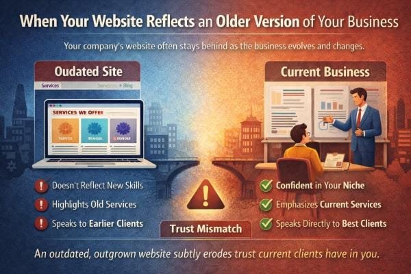
When Your Website Reflects an Older Version of Your Business
Businesses evolve faster than websites. That’s normal.
What’s not normal is how long many businesses tolerate the gap, because it feels harmless. “The site still works.” “People can still find us.” “We’ll update it when we have time.”
But here’s what I’ve learned from watching this play out in real projects. An outdated website rarely breaks in obvious ways. It breaks quietly. It leaks trust, clarity, and momentum in small moments that add up.
I see this all the time. A company grows. Services expand. Confidence improves. Clients change.
But the website still speaks from a place that no longer matches reality.
It might undersell the work, focus on services you no longer emphasize, or speak to an audience you’ve outgrown.
In that situation, the website isn’t wrong. It’s just outdated in spirit.
That mismatch subtly affects trust, and it happens in a few predictable ways.
The “version gap” is a trust problem, not a design problem
Most owners describe this as a design issue. “The site looks old.”
But the real issue is the version gap.
Your business today has different standards than your business two or five years ago.
- You communicate differently
- You have tighter processes
- You know your ideal clients
- You’ve refined what you will not do
- You’ve learned what causes problems and how you prevent them
If the website doesn’t reflect those upgrades, visitors are reading an older version of you.
And people are surprisingly good at detecting that.
Even if they cannot name it, they feel it. The site feels cautious when the business is confident. It feels vague when the business is specific. It feels generic when the work is no longer generic.
That creates a micro-doubt, and micro-doubts create exits.
How the mismatch shows up in real life
When a site is outdated in spirit, you usually see the same symptoms:
- more price shoppers and fewer ideal clients
- more “Can you send pricing?” messages and fewer “When can we start?” messages
- leads who misunderstand what you do, then ghost when corrected
- long calls where you spend half the time explaining basics
- visitors who say “I thought you only did…” even though you have moved on
I’ve had business owners tell me, “Our site gets inquiries, they’re just not the right ones.” That is almost always a positioning mismatch, not a traffic issue.
Your site is attracting the audience it was written for. The problem is that you are no longer that business.
Three common forms of “outdated in spirit”
This shows up in patterns. Once you know them, you spot them instantly.
1) The website still tries to be everything to everyone
Earlier-stage businesses often keep the message wide because they want any client.
Later-stage businesses win by narrowing.
When your business matures, you usually become better at one or two things than you used to be. Your best clients come from leaning into that strength, not hiding it inside a long list.
An outdated website often still leads with the full menu.
The result is a visitor who cannot tell what you are actually known for.
If they cannot tell what you’re known for, they assume you are average.
2) The website sells effort instead of outcomes
Old sites often lead with “we work hard,” “we care,” “we have experience.”
But grown businesses sell outcomes and process.
- what changes after working with you
- how you deliver it
- what the timeline feels like
- how risk is reduced
- what you handle so the client does not have to
The moment you have real wins and repeatable methods, your website should shift from “Here’s what we do” to “Here’s what you can expect.”
If it doesn’t, visitors do not feel guided. They feel like they are hiring hope.
3) The website is speaking to past pain, not current goals
Your earlier clients often needed rescue. Your current clients often want growth, refinement, or a better standard.
A site written for rescue language attracts rescue clients.
That is not always bad, but if you’ve outgrown that segment, your website will keep pulling you back into work you no longer want.
You can feel it when you read the copy. It is aimed at beginners, budget constraints, or “just getting started,” while your actual best-fit clients are already moving and want a partner who can keep up.
Why trust drops even when everything looks “fine”
Trust is not only built by credibility signals. It is built by coherence.
Coherence means the visitor experiences your business as a clear, confident, consistent whole.
When the website reflects an older version of you, coherence breaks in subtle places:
- the tone is timid but your work is premium
- the services are broad but your process is specialized
- the photos look like stock but your brand is personal
- the case studies are old but your capabilities are new
- the call-to-action is generic but your clients need reassurance
Those are small mismatches. Small mismatches create the feeling of risk.
And people do not choose risk when they have options.
A quick “spirit audit” I use in projects
When I’m diagnosing this, I look for alignment across five areas. You can do the same.
- Positioning: Can a visitor summarize what you are best at in one sentence after 10 seconds?
- Audience: Does the copy speak to the clients you want now, or the clients you used to accept?
- Offer clarity: Is it clear what’s included, what’s optional, and what outcomes are realistic?
- Process visibility: Does the site explain what happens after someone reaches out, step by step?
- Proof freshness: Do examples, photos, and case studies match your current quality level?
When two or more of these are out of sync, the site might still be functional, but it is not doing its job.
What an updated “spirit match” looks like
When a website matches who you are now, a few things happen almost immediately:
- inquiries become more specific
- people reference your process, not just your price
- your best clients self-identify faster
- calls get shorter and easier
- you stop having to “correct” expectations
The site starts acting like a filter and a guide, not just a brochure.
Your website can be technically accurate and still be emotionally outdated.
And when your site represents an older version of your business, the cost is not only aesthetics. The cost is trust that never gets fully formed.
When the website catches up to who you are now, it does not just look better. It feels truer, and people make decisions faster when something feels true.
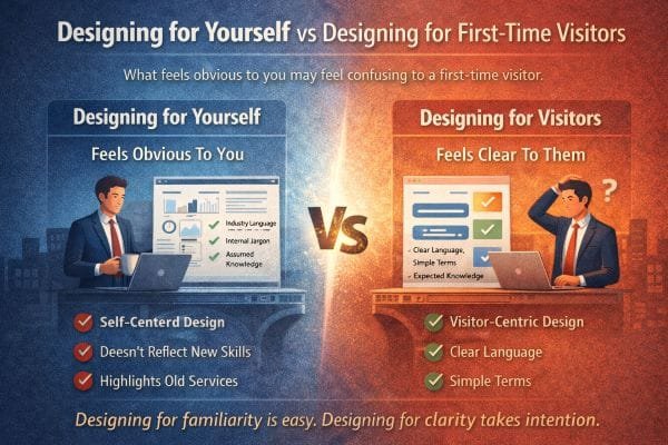
Designing for Yourself vs Designing for First-Time Visitors
This one is uncomfortable, but important.
You understand your website because you already know your business. You know what you mean when you say “full service.” You know what happens after someone fills out the form. You know which service is the right fit for which person. You know the difference between your tiers, your packages, your process, and your priorities.
Visitors don’t.
They arrive with none of your context, and they are usually not in “learning mode.” They are in comparison mode. They are scanning quickly, trying to answer a few survival questions:
- Am I in the right place?
- Do they solve my specific problem?
- Can I trust them?
- What will this cost me in money, time, and hassle?
- What do I do next?
When a site is designed for the owner’s familiarity, it assumes the visitor already understands the map. When it is designed for first time visitors, it draws the map.
I’ve rebuilt a lot of websites where the owner was genuinely surprised that people were confused. Not because the owner is out of touch, but because living inside your business makes certain things feel “obvious.” That’s a real cognitive effect. The more you know something, the harder it becomes to imagine not knowing it. In UX, that shows up as websites that are perfectly logical to the team that built them and quietly confusing to everyone else.
The familiarity trap in real life
Here are the most common ways I see this happen, even on good looking websites.
1) The homepage is written like an introduction to the business, not an orientation for the visitor
Owners tend to start with “Who we are” and “What we offer.” First time visitors need “What problem do you solve for people like me, and what should I do next?”
When the page leads with identity instead of orientation, visitors do extra work to connect the dots. Extra work is friction. Friction kills action.
A strong homepage usually does three things quickly:
- Names the outcome in plain language
- Clarifies who it’s for
- Shows a next step that feels low risk
2) Internal language sneaks in and makes the site feel like a private club
“Discovery call,” “activation,” “retainer,” “solution stack,” “managed growth,” “patient centered mobility,” “tier two,” “Phase one,” “premium package.”
None of these are inherently wrong. The problem is when the site assumes people already know what they mean.
What I do in practice is treat internal language like a spice, not the meal. Use it only after you have anchored the meaning in everyday words.
Example:
Instead of “Book a discovery call,” try “Book a 15 minute call so we can confirm fit and recommend the right next step.”
Same action, lower uncertainty.
3) Navigation mirrors your org chart, not the visitor’s decision path
A common pattern is menus that reflect how the business is structured internally.
“Services, Solutions, Industries, Resources, About.”
But visitors do not think in departments. They think in problems.
One of the fastest ways to improve clarity is to reorganize navigation around what the visitor is trying to figure out:
- “What we do” becomes “How we help”
- “Services” becomes grouped by the visitor’s goal
- A clear “Pricing” or “How it works” link exists if you can support it
- “Book” or “Contact” is obvious and consistent on every page
When navigation is aligned with the visitor’s mental model, they move with confidence. When it is aligned with your internal model, they wander.
Why first time clarity predicts engagement
Usability guidance from groups like Nielsen Norman Group has been consistent for decades on this. People do not read websites like books. They scan. They skim. They click the first thing that seems plausible. If the page does not quickly confirm relevance, they leave.
Clarity is not only about simple words. It is about reducing decision load.
First time visitors are doing mental work:
- translating your language into their situation
- trying to predict what working with you will feel like
- assessing risk
- comparing you to two or three other options
When you make them translate, predict, and guess, you lose them. When you answer those questions directly, you keep them.
In my experience, you can have great design, high quality photos, and strong credibility, and still lose leads because of one thing: the visitor never felt oriented. They never felt sure what to click, what would happen next, or whether you were meant for them.
The biggest offenders I fix in audits
If you want to get brutally practical, these are the patterns I flag most often.
Hidden assumptions
- You assume they know your service boundaries
- You assume they know the order of steps
- You assume they know the difference between options
- You assume they know what the form triggers
Fix: add one sentence wherever a visitor would otherwise have to guess.
Vague CTAs
“Learn more,” “Get started,” “Contact.”
Fix: make the action describe the outcome and the next step.
“See pricing ranges,” “Request a quote in 2 minutes,” “Book a quick call to confirm fit.”
Walls of text that look impressive but do not help decisions
Long paragraphs about mission and values without practical guidance.
Fix: keep your story, but wrap it around visitor questions. Pair values with what it means for the customer experience.
Example:
“We’re responsive” is not helpful.
“We reply within one business day, and you’ll always know what’s next” is helpful.
Pages that explain services but do not define “good fit”
This is a huge one.
A first time visitor wants to know: Is this for me?
If you do not answer that, they hesitate.
Fix: include a “Best for” and “Not the best fit if” section on key pages. It builds trust, filters bad leads, and reduces uncertainty for good leads.
Designing for clarity takes intention, but it’s measurable
One reason this gets ignored is because “confusion” is invisible in analytics. You see traffic, bounce rates, time on page. You do not see the internal moment where someone thinks, “I don’t get it,” and closes the tab.
In projects where we shift from owner familiarity to first time clarity, the improvements are usually obvious in three places:
- more clicks into the right pages
- more form submissions that include specific context
- fewer low quality inquiries and fewer back and forth questions
And in real life conversations, you start hearing better signals. People show up already understanding the process. They reference your site details. They ask higher level questions. That is the payoff of clarity.
A quick test you can run today
If you want to check whether your site is designed for you or for first time visitors, try this.
Ask someone who does not know your business to do three tasks:
- Tell you what you do after 10 seconds on the homepage
- Find the best page for their situation
- Explain what happens after they contact you
Do not help them. Just watch.
Every moment they pause is friction. Every question they ask is a missing piece. That is exactly what first time visitors feel, except they do not ask you. They leave.
Designing for familiarity is easy. Designing for clarity takes intention.
Clarity means you stop assuming visitors know what you mean. You define it. You guide them. You show what happens next. You make it safe to take the next step.
That is what converts first time visitors into real inquiries.
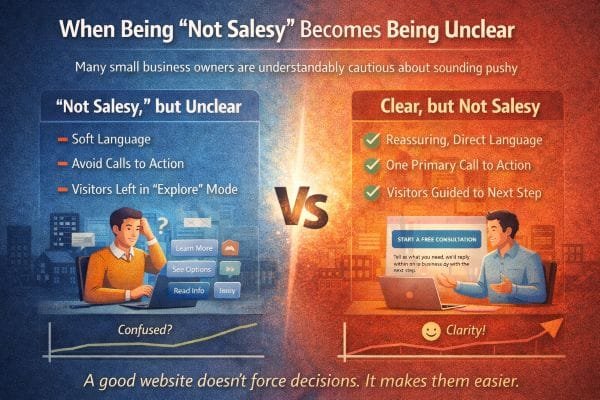
When Being “Not Salesy” Becomes Being Unclear
A lot of small business owners are understandably cautious about sounding pushy.
They’ve seen the cringe marketing. The fake urgency. The manipulative countdown timers. The aggressive “BUY NOW” energy that feels wrong for a local business that survives on trust.
So they do the opposite.
They soften language.
They avoid direct calls to action.
They let visitors “explore.”
They keep everything open ended so nobody feels pressured.
I get it. I’ve worked with plenty of owners who are genuinely good at what they do and genuinely uncomfortable with selling. They want their website to feel respectful, calm, professional.
The problem is this.
A website can be respectful and still be clear.
But when “not salesy” turns into “not specific,” you create the very thing you were trying to avoid.
You create resistance.
Because clarity is not pressure. Confusion creates more resistance than direct guidance ever will.
What “not salesy” usually looks like on the page
When I audit sites, I can often tell in 30 seconds when an owner tried to avoid selling. The patterns repeat.
- The primary button says “Learn more” everywhere
- The homepage is mostly descriptive, with no clear next step
- The service pages explain features but avoid naming outcomes
- Pricing is avoided completely, even as a range
- Contact pages feel like a blank form with no expectations set
- The copy avoids making any promise or commitment, so it says nothing concrete
The intent is good. The impact is not.
Visitors do not experience this as “wow, they’re so chill.”
They experience it as, “I’m not sure what to do here,” or “I can’t tell if they’re for real.”
The silent truth about how people use websites
Most visitors are not browsing for fun. They are trying to solve something.
They might be:
- trying to pick between three providers
- stressed about making a wrong choice
- worried about wasting money
- short on time
- unsure what they even need
- hoping someone will guide them without making them feel dumb
When your site stays vague to avoid pressure, it forces the visitor to do the hard work:
- figure out what service fits them
- guess what the process is
- guess the ballpark price
- guess how long it will take
- guess whether you are the right kind of provider
That is a lot of guessing.
Guessing feels risky. Risk makes people leave.
This is why clarity is a conversion tool that does not require any “salesy” tone at all. It simply removes guesswork.
Confusion triggers the same reaction as distrust
Here’s something I learned early, and it shows up constantly.
When people feel uncertain, they protect themselves.
They hesitate, they postpone, they open a new tab, they ask for “just pricing,” they say “I’ll get back to you,” and they disappear.
Not because they hated your work.
Because the website never helped them feel safe enough to take a step.
Unclear sites accidentally create three fears:
- Fear of commitment
If it is not clear what happens after contact, the form feels like a trap. - Fear of being sold to
Ironically, vague sites feel more salesy to cautious visitors, because they suspect the details are being held back until a call. - Fear of picking wrong
If your site does not explain who you are best for, visitors cannot self select confidently.
So the attempt to be gentle becomes the thing that increases friction.
The difference between “pressure” and “guidance”
Pressure sounds like:
- “Limited spots, act now”
- “Don’t miss out”
- “Buy before it’s gone”
- “Only today”
Guidance sounds like:
- “If you’re not sure what you need, start here”
- “Most people choose option A when they want X”
- “Here’s what happens after you reach out”
- “Here’s a realistic range so you can plan”
- “If this isn’t the right fit, I’ll tell you quickly”
Guidance lowers uncertainty. Pressure increases emotion.
Most small businesses do not need pressure. They need guidance.
Why soft CTAs fail even when people like the site
The most common weak call to action is “Learn more.”
It is polite, but it is also vague.
Learn more about what?
And why now?
And what happens after?
A good CTA does not need hype. It needs specificity.
Better CTAs are simple and direct:
- “Get a quote”
- “Check availability”
- “See pricing ranges”
- “Book a quick call”
- “Request a callback”
- “Send details, get a plan”
What makes these work is not that they are aggressive. It is that they tell the visitor what they are doing and what they get.
When the CTA is clear, the visitor feels in control. Feeling in control is the opposite of feeling pressured.
The “polite but directionless” website problem
I’ve seen this in service businesses especially.
The site is warm. The photos are nice. The language is gentle. The brand is friendly.
But there is no clear path.
No recommended starting point.
No obvious “next step for your situation.”
No explanation of what happens after contact.
No boundaries or expectations.
So the visitor wanders, then leaves.
A good website does not just describe a business. It shepherds a first time visitor through a decision path.
That path can be calm and friendly, but it must exist.
Practical ways to be clear without being salesy
These are the fixes I keep coming back to because they work across industries.
1) Add a “Start here” section for first time visitors
This is huge for clarity.
Example structure:
- “If you need help choosing, start with a 10 minute call”
- “If you already know what you want, request a quote”
- “If you’re just researching, see pricing ranges and examples”
That turns a confusing site into a guided experience.
2) Make your process visible
A simple 3 to 5 step process section removes fear.
People relax when they can predict the journey.
Even a basic version helps:
- Reach out
- We reply within X
- Quick call to confirm fit
- Proposal with scope and timeline
- Start date and kickoff
This is not sales copy. It is reassurance.
3) Define “best fit” and “not the best fit”
This builds trust fast because it shows confidence and honesty.
Visitors want to self select. Help them.
- Best fit for: X, Y, Z
- Not ideal if: A, B, C
This also protects your time by filtering out the wrong leads.
4) Use calm, direct language instead of vague language
You can keep a gentle tone and still be precise.
Vague: “Let’s connect”
Clear: “Send a message and tell us what you need. We’ll reply within one business day.”
Vague: “Get started”
Clear: “Book a 15 minute call to see if we’re a fit.”
Vague: “Explore our services”
Clear: “See the three ways we help most customers.”
5) Reduce the perceived risk of taking the next step
People hesitate because they fear commitment.
Lower the perceived risk:
- “No obligation”
- “Quick call”
- “We’ll tell you if it’s not a fit”
- “You’ll get a clear next step either way”
Not as a gimmick, as a real expectation you can honor.
A good website doesn’t force decisions. It makes them easier.
Being “not salesy” should never mean being unclear.
Clarity is a form of respect. It saves people time. It reduces anxiety. It helps them choose the next step with confidence.
And when you guide people clearly, you do not lose trust. You gain it.
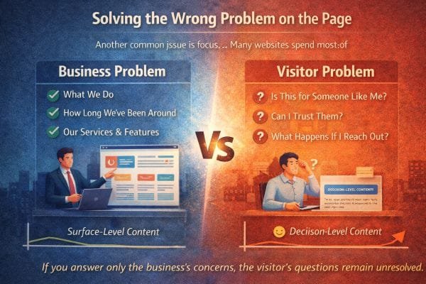
Solving the Wrong Problem on the Page
Another common issue is focus.
A lot of websites put most of their effort into answering the question the owner cares about.
“What do we do?”
So the page becomes a brochure.
It leads with what the business does, how long they’ve been around, and a big list of services and features. All of that can be true, and still miss the real job of the page.
Because first time visitors are not hiring your business description. They are trying to make a decision under uncertainty.
In real projects, this is one of the biggest gaps I see. The owner believes the site is “clear” because it explains everything. But the visitor still hesitates because the site is solving the wrong problem.
The visitor’s problem is not “I need more information.”
The visitor’s problem is “I need to feel safe choosing a next step.”
That’s a different job.
The two sets of questions people bring to a website
Most sites answer what I call the “business questions”:
- What do you do?
- What services do you offer?
- How long have you been around?
- What makes you different?
- What features do you include?
Those are fine. But visitors arrive carrying a second set of questions, and these are the ones that actually decide whether they act.
The “decision questions”:
- Is this for someone like me?
- Can I trust them?
- What will this feel like?
- What happens if I reach out?
- How much effort will this take from me?
- What could go wrong, and how do they handle it?
- Will I be judged for not knowing the right terms?
- Will this turn into a sales call I regret?
If your site answers the first set but ignores the second, it feels incomplete, even if everything looks right.
People cannot always explain why they bounced. They just feel uncertain and keep looking.
Why “what we do” is rarely the primary conversion problem
Here’s the uncomfortable part.
Most visitors can figure out what you do within a few seconds if your category is obvious. Plumber, dentist, web designer, NEMT, contractor, attorney, salon.
The category is not the hard part.
The hard part is the implied risk.
- Will this be expensive?
- Will it be a headache?
- Will they show up?
- Will they communicate?
- Will I feel taken advantage of?
- Will this solve my situation or just sell me a package?
That is why the best converting pages are not the ones that explain the most. They are the ones that remove the most uncertainty.
The “wrong problem” pattern I see in audits
When a page is solving the wrong problem, it usually has these traits:
- The headline describes the business, not the visitor’s outcome
“Full Service Digital Agency” instead of “Get more booked jobs with a site that answers customer questions fast.” - The first section is about the company story before the visitor feels oriented
People care about your story after they feel you can help them. - The services list is long, but the “best fit” is unclear
Too many options without guidance reads like “we’ll do anything.” - Proof is generic
“Trusted by many” instead of specific examples, results, and situations. - The contact form is a cliff
No explanation of what happens after, response time, or what to include.
None of this is “bad design.” It is misaligned intent.
The page is trying to describe. The visitor needs to decide.
How to solve the right problem without sounding salesy
The fix is not to hype the page up. It is to aim the page at decision support.
Here’s the structure that consistently performs better in my experience, especially for service businesses.
1) Start with the visitor’s situation, not your identity
A strong opening does three things fast:
- names the outcome the visitor wants
- names who it is for, in plain language
- reduces fear with one concrete expectation
Example pattern:
“We help [specific group] achieve [specific outcome] without [common fear].”
This reads as helpful, not salesy, because it is framed as clarity.
2) Add a “Who this is for” section early
This is one of the highest trust sections you can add.
- Best for: (3 to 6 bullets)
- Not ideal for: (2 to 4 bullets)
This is not exclusion for ego. It is guidance.
It also protects you by filtering out bad leads.
3) Explain “how it works” before you explain “why we’re great”
People want predictability.
A simple process like:
- Reach out
- We reply within X
- Quick call to understand your situation
- You get a plan, timeline, and price range
- Work begins, with check ins
This removes the fear of stepping into a vague sales funnel.
4) Use proof that answers trust questions, not ego questions
A lot of websites use proof to impress.
But the visitor is asking: “Will they treat me well and solve my situation?”
So proof should cover:
- reliability and responsiveness
- what the experience felt like
- the type of customer and problem
- what changed after the service
Even without hard numbers, you can be specific.
Example:
“Most of our clients come to us after a frustrating experience with a slow vendor. Our process is designed to keep communication tight and timelines clear.”
That kind of specificity builds trust because it mirrors real pain.
5) Make the next step feel safe and defined
This is where many sites fail.
A good CTA is not “Contact us.”
It is “Here’s what happens next.”
Add:
- what to send
- how long it takes
- when you reply
- what the visitor gets
Example:
“Send a message with your goal and your timeline. We’ll reply within one business day with a clear next step.”
This reduces the fear of commitment.
A practical gut check I use
When I’m reviewing a page, I ask a simple question:
If someone is nervous, busy, and comparing options, does this page make them feel calmer or make them feel like they have homework?
If the page creates homework, it is solving the wrong problem.
Homework is reading more, clicking around, decoding terms, guessing pricing, wondering what happens after contact.
A decision friendly page reduces homework.
Most websites are built to describe a business.
High performing websites are built to guide a decision.
They still explain what you do, but they put that information in service of the visitor’s real questions:
Is this for me?
Can I trust you?
What happens next?
Answer those clearly, and the page stops feeling incomplete. It starts feeling like a guide, and guides convert.
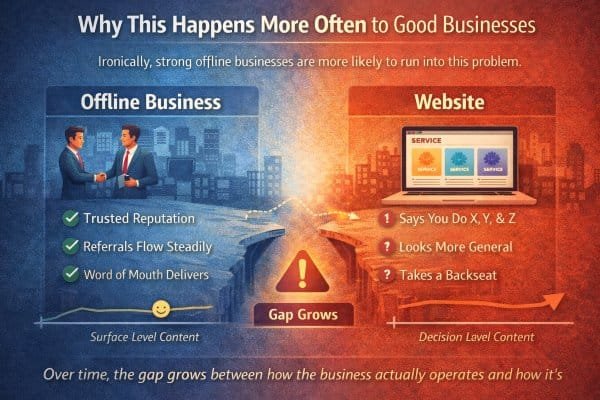
Why This Happens More Often to Good Businesses
This is one of the most ironic patterns I see.
The businesses that struggle most with their website are not always the ones doing poor work. In many cases, they are the ones doing great work offline.
They have real relationships. They get referrals. They have repeat customers. They’re known locally. They show up, deliver, and people talk. Word of mouth works.
And because word of mouth works, the website rarely feels urgent.
It becomes a background asset.
Not because the owner doesn’t care, but because the business has proof of demand without it. The site is “fine,” and the to do list always has louder fires.
Over time, the gap grows between how the business actually operates and how it’s presented online.
Nothing breaks. It just stops helping as much as it could.
The referral cushion delays the website reality check
Referrals are a blessing, but they can hide website problems for a long time.
Here’s why.
A referral lead behaves differently than a cold lead.
- They arrive with trust borrowed from the person who referred them
- They already believe you’re competent
- They often come ready to hire, not just to research
- They tolerate more friction because the relationship is already warm
So even if the website is unclear, outdated, or weak at guiding decisions, referrals still convert.
The owner looks at the pipeline and thinks, “We’re doing fine.”
And they are.
But the site is still costing them, quietly.
Not by breaking conversions, but by limiting growth.
Good businesses upgrade internally faster than they upgrade publicly
Strong businesses mature. They get sharper.
They learn what works. They refine. They build a better process. They raise standards. They get better at communication, timelines, onboarding, follow ups, and problem prevention.
Internally, the business improves year after year.
But the website often stays frozen at the moment it was built.
It still speaks like the business is earlier stage:
- broad service lists instead of a clear specialty
- generic messaging instead of confident positioning
- old photos, old work examples, old language
- no clear process even though the business now has one
- no filtering even though the owner has learned what clients they do not want
The business is version 5.0.
The website is version 2.0.
That version gap is where trust and clarity start leaking.
The “busy owner” trap is real
The better the business gets, the busier it gets.
And the busier it gets, the less time there is to step back and look at how the business is being perceived online.
That is why website drift is common in successful service businesses.
You are spending your best hours doing the work, managing people, serving clients, handling operations.
Website work feels optional, because it does not scream.
The problem is that the website is the only salesperson that works 24/7. When it is outdated or unclear, it does not create emergencies. It just creates missed opportunities.
What “it stops helping” looks like in real life
When a good business has an underperforming website, you often see these symptoms:
- You get enough leads, but not the best leads
- People call and ask questions your site should answer
- You keep repeating yourself on every sales call
- Prospects misunderstand what you do and what you do not do
- You lose deals to businesses that look clearer online, even if they are weaker in reality
- You avoid sending people to your website because you prefer explaining in person
That last one is a big tell. If you hesitate to share your website because it does not represent you well, the site is not helping. It is only existing.
I’ve seen owners rely on Instagram, Facebook, Yelp, or Google reviews as the “real proof” because they feel their site does not capture the true quality. That is a clarity gap, not a capability gap.
Why good businesses underestimate how often people still check the site
Even referral leads check the website.
They might not tell you, but they do it.
They are confirming:
- legitimacy
- professionalism
- whether you look current
- whether your offer matches what they were told
- whether you feel like someone they can talk to
If the website feels generic, dated, or confusing, it introduces doubt into a lead that should have been easy.
It does not always kill the lead, but it can slow it down, shrink the deal size, or attract a different type of client than you want.
The hidden cost: you can’t scale word of mouth with intention
Word of mouth is powerful, but it is not predictable.
It comes in waves. It depends on timing. It depends on who is talking about you. It does not always show up when you want it.
A strong website turns reputation into a repeatable system.
It does three things that word of mouth alone cannot reliably do:
- Pre-sells your process
So clients arrive already understanding how you work. - Filters out bad fit leads
So you spend your energy on the right people. - Expands beyond your current network
So growth does not depend only on who knows you.
This is where a lot of great businesses hit a ceiling without realizing it. They feel busy, but not in control. They feel successful, but growth feels random.
A website that matches the business turns success into something you can steer.
Why nothing breaks, but performance declines
The slow decline is what makes this tricky.
Websites do not fail loudly.
They fail quietly through small frictions:
- unclear messaging that makes people hesitate
- no process explanation that makes reaching out feel risky
- calls to action that are too soft or too vague
- proof that is present but not specific
- pages that describe services but do not guide decisions
No single issue looks dramatic. But together they reduce conversion and lead quality.
The business still survives because the offline engine is strong.
But online potential stays locked.
How I explain it to owners
I often frame it like this:
Your website is either doing one of two jobs.
- It is confirming decisions people already made
- Or it is helping people make decisions
Referral heavy businesses usually have a website that only confirms.
Growth minded businesses need a website that helps people decide.
Both can look fine. Only one creates leverage.
Good businesses do not ignore their websites because they do not value them.
They ignore them because the business is already working.
But “working” is not the same as “working as hard as it could.”
Nothing breaks. It just stops helping as much as it could.
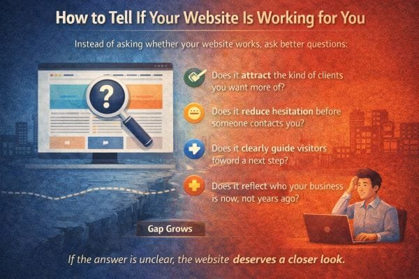
How to Tell If Your Website Is Working for You
Most people ask the wrong question: “Is my website working?”
Because “working” can mean almost anything. A site can look good, load fast, and still quietly underperform. It can get traffic and still attract the wrong leads. It can generate inquiries and still leave you doing extra explaining on every call.
So instead of asking whether your website works, ask better questions that reveal whether it is doing the jobs a strong website is supposed to do.
A website is not just a digital brochure. It is a decision support system. It should reduce uncertainty, guide action, and pre qualify people before they reach you.
Here’s how I check whether a site is truly working, using signals I’ve seen across service businesses over and over.
1) Does it attract the kind of clients you want more of?
This is the first and most important test.
A website can produce leads and still be failing if those leads are consistently the wrong fit.
Look at your last 20 inquiries and ask:
- How many were genuinely ideal?
- How many were price shoppers who never intended to invest?
- How many were confused about what you do?
- How many wanted something you do not offer anymore?
- How many turned into projects you actually enjoyed and would repeat?
In my experience, when a site is aligned, you start hearing phrases like:
- “I read your site and it sounds like exactly what we need”
- “Your process makes sense, can we talk timing?”
- “I like that you focus on [specific thing]”
When a site is not aligned, you hear:
- “So what do you actually do?”
- “Can you just send pricing?”
- “Do you also do [random thing]?”
- “I’m not sure which service I need”
Those are not just conversation issues. They are website positioning issues.
Practical fix mindset:
If your best clients are not showing up, it is rarely a “more traffic” problem first. It is usually a “message attracts the wrong people” problem.
2) Does it reduce hesitation before someone contacts you?
Hesitation is the silent killer.
People do not leave a site because they hate it. They leave because they are unsure.
When a site reduces hesitation, it answers the questions people are afraid to ask:
- What happens after I reach out?
- How long will it take to hear back?
- What will you ask me for?
- What will this roughly cost?
- How do you work?
- What if I’m not sure what I need?
Here are real world signs your site is not reducing hesitation:
- People submit forms with almost no details, like they are testing the waters
- People DM you on social instead of using the site, because the site feels too formal or unclear
- Calls start with 10 minutes of basic explanation about what you do and how it works
- Prospects say “I didn’t want to bother you” or “I wasn’t sure if this is the right place”
Those are all uncertainty signals.
What I add in these cases is not hype. It is reassurance through clarity:
- response time
- what the first call is for
- what they will get after the call
- examples of common situations you help with
- a clear “best fit” section
When you remove unknowns, people stop acting like they are interrupting you and start acting like they are choosing you.
3) Does it clearly guide visitors toward a next step?
A surprising number of sites have no true primary path.
They have buttons, but they do not guide.
The visitor is left to decide:
- Which page matters?
- Which service is right?
- Whether they should call or fill the form
- Whether they should ask for pricing or “learn more”
- Whether contacting you is a commitment
A site that guides well has:
- one main call to action that stays consistent
- a “start here” option for people who are unsure
- clear next step language that explains what happens
This is where I see the biggest improvements from small changes.
Instead of “Contact,” use:
“Tell us what you need, we’ll reply within one business day with the next step.”
Instead of “Book now,” use:
“Book a quick call to confirm fit and get a timeline.”
Same action, less perceived risk.
Guidance is not pressure. Guidance is what respectful businesses do so visitors do not have to guess.
4) Does it reflect who your business is now, not years ago?
This is the “spirit match” test.
Your business evolves. Your website often lags.
Here’s how you can tell the site is representing an older version of you:
- It leads with services you no longer prioritize
- It speaks to beginners, but your best clients are experienced
- It describes what you do, but not how you do it now
- It is missing new strengths you are confident in
- It lacks boundaries you have learned to enforce
One of the clearest signals is this feeling:
You prefer explaining your business in person because the website does not capture it.
When the site matches your current business, it does not just look modern. It sounds like you. It sets expectations correctly. It attracts better fit clients because it communicates with more confidence and specificity.
A quick self audit that works
If you want a simple way to evaluate your site without guessing, do this.
Pick one core service page and test it against four questions:
- In 10 seconds, is it obvious who this is for?
- In 30 seconds, is it obvious what outcome they get?
- In 60 seconds, is it obvious what happens next?
- Is there anything that would make a cautious person hesitate?
If you cannot answer those clearly, your visitor cannot either. Instead of asking whether your website works, ask whether it is doing the specific jobs that matter:
- attracting the right clients
- reducing hesitation
- guiding next steps
- reflecting the business you are today
If the answer is unclear, the website deserves a closer look.
Because the goal is not a site that exists.
One of the most powerful “trust builders” I’ve used is a tiny block of text near the contact form that says, in plain language, what the next 48 hours look like. People relax when they can predict the next step.
When you remove unknowns, people stop acting like they are interrupting you and start acting like they are choosing you.
3) Does it clearly guide visitors toward a next step?
A surprising number of sites have no true primary path.
They have buttons, but they do not guide. That sounds small, but it is expensive.
The visitor is left to decide:
- Which page matters?
- Which service is right?
- Whether they should call or fill the form
- Whether they should ask for pricing or “learn more”
- Whether contacting you is a commitment
When visitors have to choose without context, they often choose “later.” Later is a polite no.
A site that guides well has:
- one main call to action that stays consistent
- a “start here” option for people who are unsure
- clear next step language that explains what happens
- one recommended path per visitor type, not ten equal options
This is where I see the biggest improvements from small changes.
Instead of “Contact,” use:
“Tell us what you need, we’ll reply within one business day with the next step.”
Instead of “Book now,” use:
“Book a quick call to confirm fit and get a timeline.”
Same action, less perceived risk.
Guidance is not pressure. Guidance is what respectful businesses do so visitors do not have to guess.
A quick reality check I use:
If your homepage has multiple CTAs that compete with each other, most people will take none of them. You want choices, but you also want a clear recommendation.
4) Does it reflect who your business is now, not years ago?
This is the “spirit match” test.
Your business evolves. Your website often lags.
Here’s how you can tell the site is representing an older version of you:
- It leads with services you no longer prioritize
- It speaks to beginners, but your best clients are experienced
- It describes what you do, but not how you do it now
- It is missing new strengths you are confident in
- It lacks boundaries you have learned to enforce
- Your photos, examples, and tone feel like an earlier stage
One of the clearest signals is this feeling:
You prefer explaining your business in person because the website does not capture it.
When the site matches your current business, it does not just look modern. It sounds like you. It sets expectations correctly. It attracts better fit clients because it communicates with more confidence and specificity.
In practice, this is also where owners start saving time, because the site begins doing the “first 15 minutes of the call” for them.
A quick self audit that works
If you want a simple way to evaluate your site without guessing, do this.
Pick one core service page and test it against four questions:
- In 10 seconds, is it obvious who this is for?
- In 30 seconds, is it obvious what outcome they get?
- In 60 seconds, is it obvious what happens next?
- Is there anything that would make a cautious person hesitate?
If you cannot answer those clearly, your visitor cannot either.
If you want to go deeper, add two more checks that reveal hidden friction:
- Can someone tell what you do not do, and who you are not for?
- Can someone find pricing guidance or at least a range, without feeling like they must call first?
Instead of asking whether your website works, ask whether it is doing the specific jobs that matter:
- attracting the right clients
- reducing hesitation
- guiding next steps
- reflecting the business you are today
If the answer is unclear, the website deserves a closer look.
Because the goal is not a site that exists.
It is a site that makes it easier for the right people to choose you.
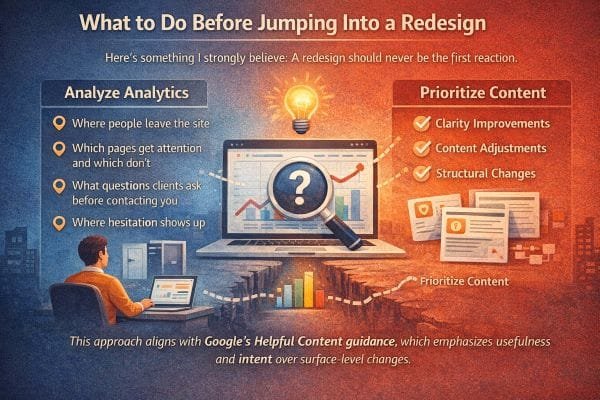
What to Do Before Jumping Into a Redesign
Here’s something I strongly believe after seeing a lot of redesigns go sideways.
A redesign should almost never be the first reaction.
Not because design does not matter, but because most “redesign pain” is not actually a color or layout problem. It is a clarity, positioning, and decision guidance problem.
When people jump straight into a redesign, they often end up with a nicer looking version of the same confusion. The site feels fresher, but leads do not improve, because the real bottlenecks were never addressed.
The smartest move is to diagnose first, then redesign only what is proven to be the constraint.
Step 1: Identify the real job the website must do
Before you touch visuals, get brutally clear on what the site is supposed to accomplish.
For most service businesses, the site has three core jobs:
- attract the right people
- reduce uncertainty enough that they take a step
- pre qualify so you do not spend time on bad fit calls
If your site is failing, it is usually failing one of these jobs, not “looking old.”
So the question is not “Do I need a redesign?”
It is “Which job is my website failing right now?”
Step 2: Look at where people leave, and treat exits as clues
When someone leaves your site, they are voting.
They are saying one of a few things:
- “This is not for me”
- “I do not trust this”
- “I cannot find what I need”
- “This feels like effort”
- “I am not ready, and nothing here helped me get ready”
To diagnose, you look at the pages where exits happen most.
Common exit hotspots:
- homepage (message mismatch)
- service pages (unclear offer or weak “best fit” guidance)
- pricing page (lack of context or perceived risk)
- contact page (fear of commitment)
- blog posts (good traffic, but no bridge to next step)
In my experience, you will learn more from exit patterns than from opinions about design.
If the homepage has high exits, it is often a positioning or clarity issue.
If service pages have high exits, it is often an offer framing issue.
If the contact page has high exits, it is almost always a hesitation issue.
Step 3: Find what people actually pay attention to
Every site has “attention winners” and “attention losers.”
You want to know:
- Which pages get the most entrances from search?
- Which pages get meaningful time on page?
- Which pages lead to contact or booking actions?
- Which pages get ignored completely?
Here is why this matters.
A redesign often treats all pages as equally important.
But in reality, 10 to 20 percent of the pages usually do most of the work.
If you improve clarity and decision guidance on the pages people already see, you can get big results without rebuilding the whole site.
This is one of the simplest performance strategies:
Upgrade the pages that already have attention before you try to earn new attention.
Step 4: Collect the exact questions clients ask before they hire
This step is pure gold because it turns your website into an extension of your real conversations.
Open a note and write down the last 30 questions prospects asked you.
Not abstract questions, real ones.
Examples:
- “Do you work with businesses like mine?”
- “How much does this typically cost?”
- “What do you need from me to start?”
- “How long does it take?”
- “Who will I be talking to?”
- “What happens if we need changes?”
- “Do you handle everything or do I need to write the content?”
- “What if I do not know what I need yet?”
Then compare that list to your website.
If the site does not answer the questions people ask most, no amount of design polish will fix conversion.
In the projects where I see the fastest improvement, it is because we build pages around those questions and answer them with calm specificity.
Step 5: Identify where hesitation shows up
Hesitation is the moment before the click, the call, the form.
It is the invisible pause.
Common hesitation triggers:
- no pricing guidance at all
- no process explanation
- vague CTAs like “get started”
- unclear boundaries or deliverables
- stock photos that do not feel real
- no proof that matches the visitor’s situation
- too many options and no recommended path
If you want to reduce hesitation, you do not need hype.
You need predictability.
What I add to reduce hesitation:
- “What happens next” blocks near every CTA
- response time expectations
- a short “best fit” section
- simple step by step process
- examples of typical projects or situations
- clear deliverables and what is included
When visitors can predict the experience, they act more confidently.
Step 6: Make targeted improvements before committing to a rebuild
This is where the practical wins usually live.
Often, clarity improvements, content adjustments, and structural changes make a bigger difference than a full rebuild.
Here are improvements that tend to outperform a redesign when the problem is uncertainty.
Clarify the first screen on key pages
Your first screen should answer:
- who this is for
- what outcome they get
- what to do next
If it does not, fix that before anything else.
Add decision support sections
These are sections that help people self select:
- Best for / Not for
- Common situations we help with
- What you get
- Timeline expectations
- How pricing works
- What happens after you contact us
Tighten navigation around visitor intent
Visitors do not want to explore a website like a museum.
They want to solve something quickly.
Your navigation should make the common paths obvious.
Improve calls to action with low risk language
Make CTAs specific and calm.
Do not just say “Contact.” Say what happens next and what they receive.
Refresh proof so it feels current and specific
Old case studies and vague testimonials can create doubt.
Update proof to match current work and current clients.
Even a few strong, specific examples beat a long list of generic claims.
Step 7: Then decide if a redesign is actually necessary
After you do the above, the need for a full redesign becomes clear.
You redesign when:
- the site structure cannot support a clearer message
- the design system is actively harming trust or usability
- the mobile experience is painful
- speed and technical issues are limiting performance
- the brand has changed enough that the visual identity no longer fits
But you do not redesign just because you feel bored of the look.
You redesign when you have evidence that the current site cannot do its job.
Why this aligns with Helpful Content principles
Google’s guidance around helpful content strongly favors pages that serve the user’s intent.
A surface level redesign does not automatically improve usefulness.
But a site that:
- answers real questions
- clarifies next steps
- matches search intent
- reduces confusion
- provides specific, relevant information
is exactly the kind of improvement that tends to perform better in organic search and in conversions.
In other words, usefulness scales. Visual refreshes alone usually do not. Do not redesign first. Diagnose first.
Most businesses do not need a brand new website. They need their current website to start doing its real job: helping the right people feel confident enough to take the next step.
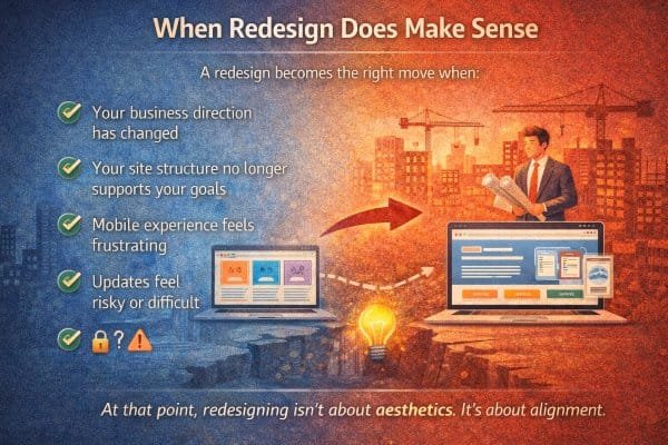
When Redesign Does Make Sense
A redesign becomes the right move when the website is no longer structurally capable of doing its job.
Not “I’m bored of the look.”
Not “my competitor’s site feels slick.”
Not “this template is trending.”
Those are normal feelings, but they’re not strong reasons.
In the projects I’ve seen succeed, a redesign makes sense when the site has become misaligned with the business in a way that small tweaks cannot fix. When the foundation is wrong, polishing the paint does not help.
Here are the situations where redesigning is the right move, and what that usually looks like in the real world.
1) Your business direction has changed
This is the most common legitimate reason.
Businesses evolve in ways that break the original website strategy.
- you moved upmarket
- you narrowed your focus
- you changed who you want to serve
- you stopped offering certain services
- you now sell a different outcome than you used to
- your delivery model changed, like packages, retainers, memberships, or a more productized offer
When that happens, your website isn’t just “outdated.” It is positioned for the wrong business.
You can edit a few sentences, but if the core structure is still built around the old direction, the site will keep attracting the old audience.
In my experience, this is when owners say things like:
- “The site makes us look cheaper than we are.”
- “We keep getting the wrong inquiries.”
- “People do not understand what we are actually best at.”
- “I feel like I have to re explain everything on every call.”
That is misalignment, not a cosmetic issue.
A redesign here is about resetting the message, the pages, the navigation, and the decision path so the site represents the business you are now.
2) Your site structure no longer supports your goals
Sometimes the problem is not content quality. It is architecture.
You can have good writing and good visuals, but if the site is structured in a way that does not match how visitors decide, it will underperform.
Common structural problems I see:
- service pages are organized by internal categories, not by visitor problems
- too many equal options, no recommended path
- important pages are buried or missing entirely
- the homepage tries to serve five audiences at once
- blog traffic has no clear bridge to conversion
- your best offer is not obvious within the first few clicks
- there is no “start here” path for first time visitors
If your growth goals include better lead quality, higher conversion, and less time spent educating prospects, structure matters more than style.
A redesign makes sense when you need to rebuild the site around clear decision paths.
That usually means creating or rebuilding:
- a clearer homepage hierarchy
- a small set of high intent service or offer pages
- a strong “how it works” page
- a proof system that matches your best clients
- a conversion bridge from informational content to next steps
If you cannot get there without fighting the current structure, redesign is the clean fix.
3) Mobile experience feels frustrating
This is not a minor detail anymore.
For many local and service searches, mobile traffic is the majority. Even when people discover you on desktop, they often revisit on their phone later, especially before contacting you.
Mobile frustration kills trust fast.
Signs your mobile experience needs more than a patch:
- text is hard to read without zooming
- buttons are small or crowded
- sticky headers cover content
- forms feel painful
- key info like phone number, hours, location, or pricing is hard to find
- pages feel heavy, slow, or jumpy while loading
- menus are confusing or too deep
I’ve seen businesses lose leads simply because the mobile contact experience felt annoying. People were willing to hire, but not willing to fight the interface.
If mobile usability is broken, a redesign is often the right move because it forces a mobile first rethink, not a desktop site squeezed down.
4) Updates feel risky or difficult
This is the quiet operational reason that pushes redesign from “nice to have” to “we should fix this.”
If updating your site feels like defusing a bomb, your website is no longer an asset.
Common signs:
- only one person knows how to edit it
- you fear breaking layout every time you change text
- plugins and themes are outdated and fragile
- your CMS workflow is messy
- adding new pages feels slow and expensive
- simple updates require a developer ticket
- the site is hard to keep secure and performant
In those cases, the website becomes frozen in time.
And a frozen website eventually becomes a trust problem because it cannot stay current.
A redesign here is about rebuilding on a stable foundation with a maintainable system:
- clean templates
- reusable sections
- predictable editing
- better performance
- fewer moving parts that break
This is alignment with operations, not aesthetics.
The deeper reason redesign works when it works
A redesign succeeds when it is treated as an alignment project.
Alignment means:
- the message matches who you serve now
- the structure matches how visitors decide
- the content answers real questions and reduces uncertainty
- the mobile experience feels effortless
- the backend allows you to keep improving without fear
When those are true, the website stops being something you “have” and becomes something that actively supports growth.
A simple litmus test I use
If you are debating redesign, ask this:
Can I realistically get this website to guide the right visitor from first click to next step, without fighting the platform, structure, or layout?
If the answer is no, redesign makes sense.
Because at that point, redesigning is not about aesthetics.
It’s about alignment.
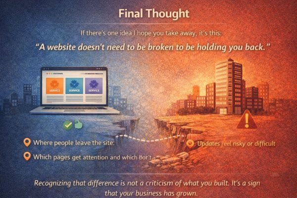
Final Thought
If there’s one idea I hope you take away, it’s this.
A website doesn’t need to be broken to be holding you back.
I’ve seen a lot of businesses with websites that are technically fine. They load. They look decent. They have the usual pages. Nothing is obviously “wrong.” And yet, the owner keeps feeling like growth is harder than it should be.
That is usually not a marketing talent problem. It is not even a traffic problem first.
It is a leverage problem.
A website can look right and still fail at the jobs that matter most.
It can fail to attract the right clients.
It can fail to reduce uncertainty.
It can fail to guide first time visitors toward a clear next step.
It can fail to reflect the confidence and clarity the business has built over time.
That is what “holding you back” looks like in real life.
Not crashes, not broken links, not embarrassing visuals.
Quiet friction.
What quiet friction actually costs
Quiet friction has a cost because it doesn’t announce itself. It shows up as:
- good prospects who never reach out
- leads that take too long to decide
- inquiries that start with confusion instead of confidence
- calls where you repeat the same explanations
- projects that are slightly off fit because your site didn’t filter
- pricing conversations that start too early because value was not framed
- a constant feeling that you need to prove yourself from scratch each time
None of this feels dramatic. But it drains time and momentum.
And it adds up.
In my experience, owners often assume this is just “how it is.” That getting clients always requires a lot of back and forth. That people always need reassurance. That leads are always random.
But when a website is aligned, the entire tone of inbound changes.
People arrive warmer, clearer, and more ready.
They reference your process, not just your price.
They ask better questions.
They understand what you do and why it matters.
That’s not luck. That’s a website doing real work.
Recognizing the difference is not a criticism
This is important.
If you built a site years ago and it no longer represents you, that is not a failure. It is a normal outcome of growth.
Most businesses build their first website at an earlier stage.
They had less clarity. Less proof. Less focus. Less understanding of what clients really ask before they buy.
Then the business matures.
- you learn your best clients
- you refine what you offer
- you tighten your process
- you raise your standards
- you become more confident in your lane
- you start caring more about fit than volume
If the website stays frozen at the earlier stage, it will keep behaving like the earlier stage.
It will attract earlier stage leads.
It will communicate earlier stage positioning.
It will require more explanation because it’s missing the decision support you now naturally provide in conversation.
So recognizing that gap is not a criticism of what you built.
It is evidence that your business has outgrown the way it presents itself.
And that is a good problem to have.
The mindset shift that changes everything
Instead of thinking about your website as a “thing you have,” think about it as a working system.
A system either creates leverage or it creates drag.
A website that creates leverage:
- tells the truth about who you are now
- makes the right people feel seen
- makes the next step feel safe
- answers objections before they are asked
- filters out bad fit leads without you needing to
- makes growth feel less random
A website that creates drag looks fine, but requires you to do all that work manually in every conversation.
That is why a site can be “not broken” and still be holding you back.
And that’s the point
Many sites work just well enough to look right while quietly failing to support the business behind them.
If you recognize that difference, you’re not behind.
You’re at a stage where tightening alignment will produce outsized results, because the business is already strong.
That’s a good problem to have.