
Your website is not broken. It is not weak. And it is not failing because you picked the wrong platform or colors.
Most of the time, it is failing because it is asking visitors to think too much, decide too much, and process too much. That realization usually brings relief first, then concern. Relief because the problem is fixable. Concern because once you see it, you cannot unsee it.
People do not leave your site because they dislike your business. They leave because their brain quietly says, this is harder than it should be. And the moment that thought appears, they are already gone.
Emotional recognition opening
If you have ever stared at your website and thought, everything is there, why is no one acting, you are not alone. Many business owners reach this point after doing everything they were told to do. They added more pages. More buttons. More explanations. More offers. More proof. More options.
It feels responsible. It feels thorough. It feels helpful.
But from the visitor’s side, it often feels overwhelming.
Most visitors arrive slightly distracted, slightly impatient, and slightly unsure. They are not in research mode. They are in survival mode. They want clarity, not completeness. When your site asks them to read, compare, scroll, choose, and understand all at once, their brain defaults to the safest option.
Leaving.
This is not a failure of effort. It is a mismatch between how humans actually make decisions and how most websites are built.

Root cause explanation
The core issue is cognitive overload. This happens when the brain is given more information, choices, or tasks than it can comfortably process in a short time.
In real life, you see this when someone opens a cluttered drawer looking for one thing and closes it without taking anything. The problem is not the drawer. It is the mental cost of sorting through it.
Websites often recreate this exact experience.
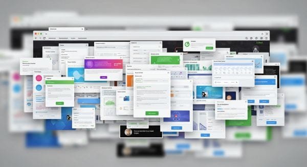
Multiple calls to action compete for attention. Headlines explain too much at once. Paragraphs stack ideas without hierarchy. Navigation menus grow over time without pruning. Every feature, service, and benefit tries to speak at the same volume.
From the inside, it feels logical. From the outside, it feels exhausting.
Visitors do not consciously think, this website has cognitive overload. They feel it as tension. Confusion. Fatigue. Uncertainty. Their brain cannot quickly answer three basic questions.
What is this
Is it for me
What should I do next
When those answers are not immediate, trust erodes quietly. Decision fatigue sets in. Even interested visitors pause. And pauses online usually end in exits.
This is why traffic alone does not convert. And why redesigns that only focus on visuals rarely fix performance.
The issue is not aesthetics. It is mental friction.
Real consequences if it continues
When a website keeps asking too much, the damage compounds over time.
Visitors skim instead of reading. Important messages are missed because nothing stands out. Calls to action feel optional rather than necessary. Leads become price sensitive because value was not clearly framed early.
Analytics often show this as high bounce rates, short session times, or visitors bouncing between pages without action. But the real loss is deeper.
You lose momentum.
Every extra second of thinking drains emotional energy. By the time a visitor reaches your contact form or booking page, they are already tired. Even small requests like filling a form or choosing a service feel heavy.
This also affects referrals. People rarely recommend sites that feel confusing, even if the service is good. They say things like, you should call them directly or it is easier if I explain it.
That is a signal that the website is not carrying its weight.
Over time, teams compensate by adding more explanations, more FAQs, more content. That often increases the overload instead of reducing it. The site grows. Clarity shrinks.
The result is a website that looks busy but performs quietly.

Clear solution framework
The solution is not removing information. It is reorganizing attention.
A high performing website does one thing exceptionally well. It reduces the number of decisions a visitor has to make before taking the right next step.
This requires a shift in thinking. Instead of asking, what do we want to say, you ask, what does the visitor need to understand right now.
Here is a practical framework to apply.
Step one: Choose one primary action per page
Every page should have one dominant goal. Not three. Not five. One.
This does not mean removing secondary options entirely. It means visually and structurally prioritizing a single path forward.
If everything looks important, nothing feels urgent.
Decide what success looks like on that page. Booking a call. Requesting a quote. Reading the next page. Then design every element to support that outcome.
Buttons, copy, layout, and spacing should all point in the same direction.
Step two: Reduce visible choices above the fold
The first screen matters more than any other part of the site. It sets emotional tone and mental load.
Limit choices here aggressively.
One clear headline that explains value in simple language. One supporting line that removes doubt. One primary call to action.
Not a paragraph. Not a list of services. Not a carousel.
You can explain more as the visitor scrolls. But you must earn the scroll first.
Step three: Replace explanation with guidance
Many websites explain. Few guide.
Explanation tells people what you do. Guidance tells them what to do next.
Instead of listing services, frame them as paths. Instead of features, show outcomes. Instead of options, recommend.
People trust sites that feel decisive. Guidance reduces anxiety. It signals expertise without saying it.
If you know what works best for most clients, say so. That alone reduces decision fatigue.
Step four: Group information into mental chunks
The brain handles information better when it is grouped into clear, labeled sections.
Avoid long walls of text or scattered ideas. Use structure to signal meaning.
Each section should answer one question only. When sections try to answer multiple questions, the brain slows down.
Whitespace is not wasted space. It is thinking space.
Step five: Delay complexity until commitment increases
Do not introduce advanced details too early.
Pricing breakdowns, technical specs, comparisons, and edge cases should appear after interest is established, not before.
Think of the website as a conversation. You do not start a conversation by explaining everything. You respond to curiosity as it grows.
This keeps visitors moving forward instead of stopping to evaluate too soon.
Understand This –
Your website does not need to work harder. It needs to think less.
When you reduce friction, visitors feel it immediately. Pages feel calmer. Decisions feel easier. Actions feel natural.
This is not about dumbing things down. It is about respecting how people actually think when they are busy, unsure, or overwhelmed.
Growth comes from removing unnecessary effort, not adding more persuasion.
When your site stops asking visitors to do all the work, trust increases. Momentum builds. Conversions follow without pressure.
Once you see cognitive overload for what it is, clarity becomes a design choice, not a mystery.
And now you know exactly what to do.